In today’s data-driven business environment, success doesn’t just hinge on access to data—it depends on having the right data, in the right format, at the right time. Departments like Finance, Marketing, and Sales face constant pressure to make strategic decisions at speed. But when they’re forced to rely on generic reports or siloed spreadsheets, insights are delayed, decisions are reactive, and opportunities are missed.
An IBM article quoting Gartner indicates that companies that effectively use business intelligence tools are 5x more likely to make faster decisions than their competitors. Meanwhile, Forrester reports that although 74% of firms aspire to be data-driven, only 29% actually succeed at connecting analytics to meaningful action.
The disconnect? Often, it’s the lack of custom BI dashboards that reflect the unique workflows, priorities, and KPIs of each team. While off-the-shelf dashboards may offer a quick setup, they fail to deliver the relevance and clarity needed to support confident decision-making. That’s why organizations are shifting toward tailor-made BI dashboards—built not just to visualize data, but to enable action.
Let’s explore how custom dashboards can transform the way your Finance, Marketing, and Sales teams think, act, and perform.
Why Custom BI Dashboards Matter
In the race to become more data-driven, many organizations adopt out-of-the-box BI solutions hoping for instant results. While these generic dashboards might offer a quick setup and attractive visuals, they often lack the depth, flexibility, and context needed for real decision-making.
The problem? One-size-fits-all rarely fits anyone well.
Every team operates differently—with distinct workflows, KPIs, and strategic goals. What Finance cares about isn’t what drives Marketing. What Sales needs to see in real time may not even exist in a finance dashboard. When teams are forced to navigate dashboards filled with irrelevant metrics, they not only waste time—they lose trust in the data.
Turning Team-Specific Questions into Actionable Insights
Custom dashboards are purpose-built to answer the specific, high-impact questions each team faces daily. These questions vary across departments—what matters to Finance might be irrelevant to Marketing or Sales. By tailoring dashboards to each team’s goals, organizations empower faster, more informed decision-making.
Finance: Are we on budget?
The finance team focuses on budget adherence, forecasting accuracy, and financial risk management. They rely on real-time dashboards to monitor expenses, revenue trends, and cash flow. A well-designed dashboard helps identify areas of overspending or underutilized resources early enough to adjust. It also simplifies audit preparation and ensures regulatory compliance.
Marketing: Which campaigns are driving ROI?
For marketing teams, data drives customer insights and campaign performance. They need to track reach, engagement, conversion rates, and most importantly, return on investment (ROI). Custom dashboards powered by multi-touch attribution and A/B testing allow marketers to refine targeting, messaging, and channel strategy—ensuring every dollar spent drives business growth.
Sales: What’s our pipeline health this quarter?
Sales leaders require real-time visibility into lead quality, deal velocity, and conversion rates. Dashboards help them assess the strength of their pipeline—how many deals are in progress, where bottlenecks occur, and which reps are excelling. With predictive analytics, sales managers can forecast revenue, identify risks, and adjust strategies to meet or exceed their targets.
These are not questions a generic dashboard can answer well. A custom BI dashboard zeroes in on what truly matters to each team, filters out irrelevant data, and gives them the clarity to move from insight to action—fast.
What Makes Custom Dashboards Powerful
The true value of a dashboard isn’t in the data—it’s in how that data drives smarter, faster decisions. Custom dashboards are designed with intention, aligning insights with real business needs and eliminating the clutter that slows teams down.
Here’s what sets them apart:
- Align with Business Objectives: A dashboard isn’t just a data display—it’s a strategic tool. Custom dashboards are built around organizational goals, ensuring the data presented is directly linked to key outcomes like revenue growth, customer retention, or cost optimization. When every chart and metric reflects what matters most to the business, teams can align their daily actions with long-term goals.
- Allow Role-Specific Views and Insights : Different users need different insights. Executives want summaries and forecasts; analysts want granular data. Custom dashboards enable role-based access, showing each user only the data they need—no more, no less. This not only reduces information overload but also enhances focus and productivity across departments.
- Enable Quicker, Data-Backed Decision-Making: Time is a competitive advantage. When dashboards are tailored to highlight relevant, real-time metrics, teams can identify trends, issues, and opportunities without delay. No more digging through spreadsheets or waiting for monthly reports—just fast, confident decisions backed by reliable data.
- Foster Cross-Functional Visibility and Accountability: Custom dashboards that pull data across departments break down silos. When Finance, Marketing, and Sales can see how their work interrelates, they collaborate more effectively. Shared dashboards promote transparency, encourage data-driven conversations, and ensure everyone is working toward common KPIs.
More than just a reporting tool, a custom dashboard becomes a strategic partner—helping leaders identify risks early, seize new opportunities, and optimize performance in real time.
Quick Tip
Before designing your dashboard, ask: What are the top 3 decisions your team makes regularly? A McKinsey study found that managers spend up to 40% of their time making decisions—often slowed down by hard-to-find data. Focus your dashboard on these key decisions to deliver faster, more impactful insights.
Understanding the Unique Needs of Each Team
Not every team speaks the same data language. The insights that fuel decisions in Finance won’t look the same as those in Marketing or Sales. That’s why successful BI strategies begin by mapping dashboard design to the real questions and metrics that drive each function. Let’s explore how custom dashboards deliver clarity and speed across departments—starting with Finance.
Finance Dashboards: Precision Overload
Finance teams manage revenue, expenses, forecasting, and risk. Their dashboards must present a clear financial snapshot that empowers CFOs and analysts to act quickly.
Key Metrics to Include:
- Revenue vs. Target: Shows how actual earnings stack up against planned revenue goals, helping track overall business performance and identify growth gaps.
- Budget vs. Actual: Monitors whether spending is aligned with financial plans, making it easier to detect overspending or under-utilization early.
- Gross & Net Profit Margins: Highlights profitability at both operational and bottom-line levels, allowing leaders to fine-tune pricing, costs, or strategy.
- Accounts Payable/Receivable Aging: Tracks outstanding invoices and payments due, helping maintain healthy cash flow and avoid late penalties or payment delays.
- Cash Flow Projections: Provides a forward-looking view of available funds, enabling better planning for investments, expenses, and emergencies.
Well-designed dashboards allow finance leaders to spot cost overruns early, adjust forecasts in real-time, and maintain healthy cash reserves. Use conditional formatting (e.g., red/green indicators) to highlight key financial thresholds. Studies show that color-coded information can be processed up to 60% faster than monochrome alternatives—making critical insights visible at a glance
Marketing Dashboards: Campaigns in Context
Marketing teams juggle multiple platforms, strategies, and goals—all generating data in silos. Without a unified view, it’s nearly impossible to measure what’s really working. A well-structured marketing dashboard brings everything together, aligning performance metrics with strategic goals like lead generation, brand awareness, and conversion rates. For affiliate marketing insights, this affiliate dashboard guide offers a step-by-step approach to tracking partner performance. The right dashboard empowers marketers to pivot faster, test smarter, and maximize impact across the funnel.
Key Metrics to Include:
- Campaign Performance (CTR, CPC, CPA): Tracks ad effectiveness by showing click-through rates, cost per click, and cost per acquisition—essential for optimizing spend and creative.
- Traffic Sources & Bounce Rates: Reveals which channels (organic, paid, referral, direct) drive traffic and how users behave upon arrival, helping refine targeting and messaging.
- Funnel Conversion Rates: Highlights drop-off points across the marketing funnel, helping improve user journeys from awareness to conversion.
- Customer Segmentation & Lifetime Value: Helps identify high-value customer groups and tailor campaigns to increase loyalty, engagement, and long-term revenue.
- Email Open & Engagement Rates: Measures how well subject lines, send times, and content resonate with your audience—vital for lead nurturing and retention.
Custom dashboards help marketing teams optimize budgets, double down on high-performing channels, and clearly demonstrate ROI to leadership. Embed UTM parameters in all marketing campaigns to ensure accurate tracking within your BI dashboard. According to HubSpot, businesses that use UTM-tagged URLs see up to 30% more accurate attribution, resulting in better campaign optimization.
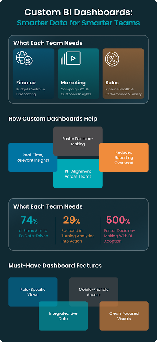
Sales Dashboards: Performance in Real Time
Sales teams operate in high-pressure, fast-paced environments where timing is everything. To hit targets and stay competitive, they need real-time visibility into performance, pipeline health, and forecast accuracy. A well-crafted sales dashboard doesn’t just report numbers—it empowers action. From frontline reps to senior leaders, custom dashboards help track progress, course-correct strategies, and close deals faster. They must be mobile-responsive, filterable by region or rep, and tightly integrated with your CRM to be truly effective.
Key Metrics to Include:
- Pipeline Value by Stage: Breaks down total deal value across each stage of the pipeline, helping sales leaders understand where deals are stalling and where to focus attention.
- Lead-to-Customer Conversion Rate: Measures the percentage of leads that become paying customers, helping assess lead quality and the effectiveness of the sales process.
- Sales Rep Performance & Leaderboards: Highlights individual rep activity and outcomes (calls, meetings, closed deals), promoting healthy competition and guiding targeted coaching.
- Win/Loss Analysis; Analyzes why deals were won or lost—whether it’s pricing, competition, timing, or lack of fit—to improve sales strategy and messaging.
- Forecast vs. Actual Sales: Compares projected revenue to actual closed sales, helping teams identify over- or under-performance and improve forecasting models.
With real-time updates, sales managers can coach underperforming reps, spot at-risk deals early, and eliminate friction in the sales funnel. Integrate your BI dashboard directly with your CRM (like Salesforce or HubSpot) to ensure live data feeds and eliminate manual reporting. According to Salesforce, high-performing sales teams are 1.5x more likely to use real-time sales dashboards than underperformers.
Quick Tip
The most effective dashboards aren’t just data displays—they’re decision accelerators. Focus on team-specific KPIs, integrate live data sources, and design for interaction (not observation). When dashboards shorten time-to-insight, performance naturally follows.
Key Elements of a Successful BI Dashboard
A truly impactful BI dashboard does more than display data—it tells a story, reveals patterns, and prompts action. Yet many dashboards fail not because of bad data, but poor design. Cluttered visuals, lack of interactivity, or irrelevant KPIs can quickly erode trust and usability. The best dashboards are intuitive, scalable, and built with the user in mind. They prioritize clarity over complexity and ensure every data point supports decision-making.
Core Components:
- Data Integration: Connect all relevant systems—CRMs, ERPs, Google Analytics, marketing platforms, and data warehouses—into a single source of truth. Seamless integration ensures up-to-date, consistent insights across departments.
- User Access Control: Not everyone needs to see everything. Implement role-based access to personalize the dashboard experience—so executives get strategic summaries while analysts access granular data.
- Visual Best Practices: Choose the right chart for the right insight. Use bar charts to compare values, line charts to show trends over time, and pie charts only for part-to-whole relationships. Avoid clutter, and aim for visual consistency.
- Mobile Responsiveness: Decision-makers are increasingly on the go. A mobile-friendly dashboard ensures they can access real-time insights from their phone or tablet, whether in a meeting or on the move.
Well-designed dashboards don’t just reduce manual reporting—they create a shared language of performance that aligns teams and accelerates action.
Quick Tip
Always add dynamic filters by time period, region, team, or product line. According to a Forrester report, organizations that implement interactive BI tools are 2.2x more likely to make timely, data-driven decisions than those using static reports.
Choosing the Right BI Tools
A powerful dashboard is only as good as the platform behind it. With dozens of business intelligence (BI) tools on the market, the right choice depends on your organization’s specific needs—such as the complexity of your data, your team’s technical expertise, and how you plan to scale. Whether you’re visualizing marketing performance, forecasting financial trends, or tracking sales pipelines, your BI tool should strike the right balance between functionality and usability.
Below are some popular platforms—and what makes each one shine.
Popular Platforms:
- Power BI: Ideal for organizations already using Microsoft 365 or Azure. It offers deep Excel integration, robust data modeling, and powerful AI features—making it a top choice for finance and operations teams.
- Tableau: Known for its rich visual storytelling and ability to handle complex datasets. Tableau is perfect for data-heavy environments where users want advanced analytics and pixel-perfect dashboards.
- Looker: A Google Cloud product designed for scalable, embedded analytics. It uses a modeling layer (LookML) to create reusable logic and data definitions—ideal for product and engineering teams that need embedded insights.
- Google Data Studio (now Looker Studio): A lightweight, free tool that’s best suited for marketing teams and small businesses. It connects easily to Google tools (GA4, Ads, Sheets) and enables basic reporting without requiring technical know-how.
Each platform supports custom dashboards—but they vary in terms of integration flexibility, ease of use, and pricing models. Carefully weigh your internal capabilities and long-term goals before committing.
Quick Tip
Start with a proof of concept before rolling out dashboards at scale. According to Gartner, 70% of BI initiatives fail due to lack of user adoption—often because tools are too complex or don’t deliver immediate value. Building one dashboard for one team helps validate tool choice, refine requirements, and increase buy-in.
Implementation Best Practices
Even the most powerful BI tool won’t drive impact if the dashboard isn’t thoughtfully implemented. Successful custom dashboards are not side projects—they’re strategic initiatives that demand cross-functional input, continuous iteration, and a focus on user experience. The key is to treat implementation as a change-management process, not just a technical build.
Whether you’re launching your first dashboard or refining an existing one, here are the core steps that ensure success:
Steps | What It Involves | Why It Matters |
Stakeholder Interviews | Meet with leaders and end-users across teams. Understand their questions, challenges, and decision-making workflows. | Prevents assumptions and ensures dashboards solve real problems. |
KPI Documentation | Define key metrics, data sources, and benchmarks. Align them with business priorities. | Creates a single source of truth and ensures strategic alignment. |
Wireframes & Feedback | Build mockups or prototypes. Gather feedback early and often. | Reduces rework and aligns expectations on design and usability. |
QA & Testing | Validate data accuracy, load times, and responsiveness across devices. | Boosts user trust and ensures performance at launch. |
User Training & Iteration | Provide training resources, walkthroughs, and support. Monitor usage patterns and collect feedback. | Encourages adoption and identifies areas for improvement. |
Implementing dashboards is not a one-time event—it’s an ongoing process of refinement. By involving stakeholders early, validating assumptions, and building iteratively, you create dashboards that are trusted, used, and acted upon.
Quick Tip
Hold monthly check-ins with each department to assess what’s working and what’s not. According to Forrester, companies that revisit dashboards regularly are 2.5x more likely to hit their performance goals. Iteration builds relevance—and relevance drives adoption.
Security and Compliance Considerations
When your dashboards touch finance, healthcare, or personally identifiable information (PII), data privacy isn’t just a best practice—it’s a legal obligation. Whether you’re visualizing revenue forecasts, patient data, or customer behavior, your BI implementation must be governed by strict security protocols and compliance frameworks. Mishandled data can result in regulatory penalties, reputational damage, or even business disruption. That’s why building a secure and compliant foundation is essential from day one.
Key Practices to Follow:
- Enable Role-Based Access: Ensure that only authorized personnel can view or manipulate sensitive data. For example, a sales manager doesn’t need access to salary details, and an intern shouldn’t see customer payment information. Role-based permissions help minimize internal risk.
- Audit Dashboards Regularly: Set up monthly or quarterly checks to verify data accuracy, access controls, and any anomalies. Look for unused dashboards or outdated data connections—both can become weak points in your system.
- Stay Aligned with Compliance Frameworks: Depending on your industry, you may need to adhere to one or more data regulations such as GDPR (EU), HIPAA (US healthcare), SOX (US finance), or India’s DPDP Act. Your BI environment should support encryption, consent tracking, and data minimization practices to meet these standards.
- Vet Third-Party Vendors Carefully: If you’re using external consultants or BI-as-a-service providers, ensure they follow your internal policies and compliance requirements. Ask for documentation of their security protocols and confirm their familiarity with relevant regulations.
Quick Tip
Activate user access logs and event-tracking in your BI platform to support auditing and incident response. Per IBM’s Cost of a Data Breach Report 2023, organizations with strong incident response planning and testing protocols saved an average of $1.49 million on breach-related costs compared to those lacking preparedness
Measuring Dashboard Effectiveness
Building a custom dashboard is only half the job—proving its value is where the real ROI lies. A beautiful dashboard that nobody uses, or one that doesn’t inform better decisions, is just window dressing. Measuring its effectiveness helps you iterate, improve, and ensure your BI investments drive real business impact.
Ask yourself: Is the dashboard helping people make faster, better, and more aligned decisions? Here’s how to find out.
Key Metrics to Track:
- Adoption Rate – Are people logging in?
Monitor how frequently users access the dashboard. A high adoption rate indicates it’s become part of their workflow. Low usage might signal complexity, irrelevance, or lack of awareness. - Speed to Decision – Are meetings more productive?
Track whether teams are making faster, more confident decisions. If dashboard use reduces time spent gathering data or resolving disagreements, it’s doing its job. - Reduction in Manual Reporting – Are teams spending less time on spreadsheets?
A successful dashboard should eliminate redundant Excel reports and ad-hoc queries. Talk to teams to see if they’ve gained back hours previously spent on manual reporting. - Impact on KPIs – Is performance improving?
Ultimately, dashboards should help improve real outcomes—like higher revenue, reduced churn, or better efficiency. Map dashboard use to changes in key performance indicators over time.
Quick Tip
Use your BI tool’s built-in usage analytics (like Power BI’s usage metrics or Tableau’s Admin Insights) to track how often each report is viewed, by whom, and for how long. If a dashboard isn’t used, consider simplifying it or offering training—because data only adds value when people act on it.
Ideal-World Success Scenarios: What It Could Look Like
What does success look like when your dashboards are firing on all cylinders? While every business is different, certain outcomes are universally desirable—faster decisions, better resource allocation, and stronger performance. Let’s walk through a few ideal-world scenarios that show the true power of custom business intelligence dashboards when they’re thoughtfully implemented and aligned with team needs.
Finance Scenario: A mid-sized SaaS company struggled with a time-consuming monthly budgeting process. After integrating their ERP system with a custom finance dashboard, they reduced their budgeting cycle by 40%. With real-time forecasting and spending insights, the CFO’s team made faster, more confident financial decisions—without chasing spreadsheets.
Marketing Scenario: Think of a digital marketing team juggling campaigns across multiple platforms. With a custom dashboard that brought together data from Google Ads, Meta, and HubSpot, they spotted channels with poor ROI. By reallocating 25% of their ad budget toward high-performing campaigns, they significantly improved their return on ad spend (ROAS).
Sales Scenario: A B2B tech firm struggled to close deals despite strong lead generation. After launching a stage-specific sales dashboard, they identified where leads were dropping—mainly at the proposal stage. Focused sales coaching and better content helped them increase pipeline conversion by 18%, giving leadership confidence in future forecasts.
Custom dashboards don’t just report data—they reveal patterns, spotlight opportunities, and unlock improvements that spreadsheets alone can’t. When done right, they empower teams to act with clarity, speed, and confidence.
Conclusion
A truly effective dashboard doesn’t just present data—it drives decisions. It gives teams the clarity to act, the context to collaborate, and the confidence to move forward with purpose. From forecasting revenue to analyzing campaign ROI or improving sales conversions, dashboards should align with real business goals—not just display metrics. When thoughtfully designed, they become strategic tools that reduce friction, reveal opportunities, and accelerate outcomes.
Build dashboards that empower people—not just processes. Because it’s not about more data—it’s about the right insights in the right hands.
At ZealousWeb, we help organizations unlock the full value of their data through custom BI solutions that inform, align, and transform.