ZealousWeb
Checkout redesign conversion

Before vs After — The Checkout Redesign That Reduces Cart Abandonment

February 27, 2026Posted By: Manjiri Bhate
Cart AbandonmentCheckout RedesignEcommerce OptimizationUX/UI Strategy

The checkout stage is the final and arguably the most crucial step in the customer journey. It’s where browsing, deciding, and adding to the cart either culminate in a purchase or end in abandonment. For any business, especially in e-commerce, the ultimate goal is to get customers to complete their checkout. Without this, all the marketing and product efforts fall short.

Yet, the reality is surprisingly harsh. On average, nearly 70% of online shopping carts are abandoned before completing a purchase. That’s right—almost 7 out of every 10 shoppers leave without buying. This issue is so widespread that it’s estimated that retailers lose over $18 billion in sales annually due to cart abandonment alone. And the problem is even worse on mobile devices, where abandonment rates soar above 85%.

Cart abandonment happens for many reasons, and these hurdles can make or break a sale, showing just how pivotal a well-thought-out checkout design really is. In this blog, we’ll explore how a thoughtful redesign can overcome these challenges, boost conversions, and ultimately help your business turn more browsers into buyers.

Identifying Key Issues that Caused Cart Abandonment

To create a seamless and enjoyable checkout experience, businesses must first understand the key obstacles that lead to cart abandonment. When left unaddressed, these problems create friction points that leave customers frustrated, confused, or doubtful, which ultimately causes them to abandon their carts and walk away. If high cart abandonment rates are hurting your sales, focusing on these four critical issues can help you turn things around.

Usability Problems That Frustrate Users

Checkout usability plays a vital role in converting interest into purchase, and shoppers expect a fast, straightforward process. Lengthy forms requiring excessive information, poorly organized steps, or unclear instructions make the process tedious and drive customers away. Features like auto-filling information, clear calls to action, and minimizing the number of steps can reduce friction and keep users moving forward.

Technical Glitches and Performance Bottlenecks

Technical stability is crucial during checkout. A single slow-loading page, bug, or error message can make customers lose confidence and exit immediately. Issues like broken buttons, failed coupon codes, or glitches with payment gateways interrupt the smooth flow and can escalate abandonment quickly. Ensuring the checkout system is thoroughly tested, fast, and reliable is key to preventing these costly drop-offs.

Lack of Trust and Transparency

Trust matters hugely when customers share sensitive information like payment details. Modern shoppers look for clear signs that their data is secure, such as SSL certificates, security badges, and transparent refund policies. Surprise shipping costs, hidden fees, or unclear return instructions at checkout raise suspicion and deter buyers.

Poor Mobile Experience

With smartphones now responsible for a significant portion of online purchases, neglecting mobile optimization can severely impact conversions. Many mobile users abandon carts due to problems like tiny clickable areas, slow load times, or layouts that don’t adjust properly for smaller screens. A mobile-optimized checkout means larger buttons, simplified forms, faster loading, and ensuring every step is finger-friendly so users can buy quickly and comfortably from any device.

Every abandoned cart represents a missed opportunity to boost sales and grow your business. Pinpointing exactly where and why your customers drop off empowers you to remove obstacles, reduce abandonment, and significantly increase your conversions and revenue.

Taking action on these insights improves checkout and drives sustainable business growth.

The Redesign Approach: Thoughtful Fixes and Improvements

One of the best ways to discover what’s really going wrong with your checkout is to observe how actual users interact with your site. Spend time browsing through your own checkout process regularly, and analyze user sessions to see where visitors stumble, hesitate, or drop off. These “bugs” or friction points become clear when you look at real user behavior.

Once you identify these issues, start redesigning your checkout as soon as possible. While you can address some issues on your own, a professional audit of your site will provide a clear roadmap for exactly what needs to be improved and ensure you’re not missing any hidden problems.

Safe design UX banner

Here are the core areas to focus on during your redesign:

Simplifying the Checkout Process

A streamlined checkout is your best chance to keep customers moving forward. Reduce the number of steps, minimize form fields, and avoid unnecessary distractions. For example, consider a single-page checkout design or clearly labeled multi-step progress indicators so shoppers always know how close they are to completing their purchase.

Enhancing Mobile Experience

With the majority of shopping happening on mobile devices, an optimized mobile checkout is non-negotiable. Make buttons large and easy to tap, forms auto-fill-friendly, and navigation quick and intuitive. Think about thumb reach, which is the place key buttons where they’re easiest to tap. Not only that, but mobile-specific platforms like apps tend to have significantly lower cart abandonment rates, about 20% compared to 68% on mobile web.

Improving Payment Options

Offer customers choice by integrating popular payment methods they trust, like Apple Pay, Google Pay, or local digital wallets. Also, consider flexible options like Buy Now, Pay Later programs for higher-priced items. When shoppers find their preferred payment method easily, they’re less likely to abandon their cart out of frustration.

Building Trust with Clear Messaging

Transparency is vital. Display secure payment badges, clearly state return policies, and show all costs upfront. Simple messages like “100% Secure Checkout” or “Free Returns within 30 Days” provide reassurance. Trust signals reduce anxiety and make customers more comfortable completing their purchase.

Focusing your redesign efforts on these areas creates a checkout that feels effortless, trustworthy, and tailored to customer needs. Every fix is a step closer to turning browsers into loyal buyers.

A Quick Guide for Implementation

Starting a checkout redesign might seem overwhelming, but it’s best to begin with the basics and refine as you go. A simple, well-planned approach can help you make steady progress, improve user experience, and reduce cart abandonment step by step. Fortunately, the process is straightforward and manageable when broken down into clear stages.

Collaboration Between Design and Development Teams

A successful redesign needs teamwork. Designers focus on user experience—creating easy-to-browse flows and attractive interfaces—while developers bring those designs to life with clean, functional code. When both work closely, it ensures the redesign is not only visually appealing but technically flawless. Clear communication avoids last-minute surprises and speeds up delivery.

User Testing and Feedback Integration

Before and after launching changes, involve real users to test the new checkout experience. Watching customers interact with your site reveals issues that you might miss internally. Their feedback helps you refine the design continuously, ensuring it truly meets customer needs. For example, a single confusing button or unclear error message discovered during testing can save many abandoned carts later.

Timeline and Rollout Strategy

Plan your redesign in phases rather than all at once. Start with a Minimum Viable Product (MVP), a simpler version of the revamped checkout that fixes the biggest problems. Then roll out improvements gradually, allowing time to monitor performance and gather user feedback at each step. This approach reduces risk and avoids overwhelming your team or customers with drastic changes all at once.

This step-by-step approach turns checkout redesign from a big task into clear, doable actions. Keep testing and adjusting your strategies as needed to stay effective. And whenever you want extra assurance or expertise, consult experienced professionals who specialize in checkout and UX redesigns.

Measuring the Impact

Measuring the impact of your checkout redesign is essential to understanding whether the changes are actually making a difference. Without tracking performance, you won’t know if your efforts are paying off or where further improvements are needed.

Some key metrics to track checkout performance include:

  • Cart abandonment rate
  • Checkout conversion rate
  • Average order value
  • Average checkout time
  • Device-specific conversion rates
  • Payment method usage
  • Bounce rate during checkout

By comparing these metrics before and after the redesign, you can clearly see the major improvements in customer behavior and spending. But numbers alone don’t tell the full story. Keeping a close eye on customer testimonials and behavioral insights, like feedback from surveys and session recordings, helps you understand why certain changes worked or didn’t. This qualitative data is invaluable for refining your checkout process further, ensuring it meets customer expectations and needs consistently.

Best Practices for Checkout Optimization

We’ve curated the best checkout optimization practices to help you quickly check off essential steps as you redesign your eCommerce site. These tried-and-true strategies focus on removing friction and boosting conversions by prioritizing what really matters to your customers.

Checkout optimization best practices

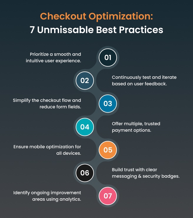
Following these can help you create a checkout experience that customers love and convert better.

Conclusion

That wraps up our blog on checkout optimization and redesign! Always remember: optimizing your checkout is one of the smartest moves you can make that reduces cart abandonment, boosts conversions, and increases customer satisfaction. Investing in thoughtful redesign pays off with more completed sales and loyal buyers.

Connect with ZealousWeb for expert-driven website, analytics, and marketing solutions tailored to your business growth. Schedule a call today to get a personalized consultation and move towards a smarter, higher-converting online store.

FAQs

Related Blog Posts

impact of visual consistency on baby brand websites

The Emotional Impact of Visual Consistency on Parents

February 27, 2026
baby brand UXecommerce brandingemotional designvisual consistency
Baby store website UX audit analysis

What Makes Regular UX Audits Non-Negotiable for Baby Store Survival?

February 27, 2026
Baby eCommerce UXDigital MarketingUX AuditWebsite Optimization
ZealousWeb

Why Lifestyle Photos Drive Higher Conversions in Baby eCommerce

February 27, 2026
Baby eCommerce MarketingeCommerce ConversionsLifestyle PhotographyProduct Image Optimization
parent shopping behavior

3 Things That Change Every Year in Parent Shopping Behavior

February 27, 2026
ecommerce trends 2025omnichannel shoppingparent shoppingparent shopping behavior
Baby Store Design Mistakes

3 Design Mistakes That Make Baby Stores Look Untrustworthy

February 26, 2026
baby eCommerce storesbaby store designeCommerce StrategyeCommerce UX
Typography for baby store UX showing trust

Fonts That Parents Trust: Why Typography Matters in UX

February 26, 2026
baby store website designecommerce conversion designtypography in ecommerceUX for baby brands
Bounce rate in baby eCommerce

Bounce Rate Red Flags — What They Mean for Baby E-commerce

February 26, 2026
baby eCommerceBounce RateConversion OptimizationeCommerce UX
baby store conversions

Optimizing Product Pages for Better Engagement & Conversions

February 24, 2026
baby eCommercebaby product pagesbaby store conversionsproduct page optimization
Baby eCommerce technology

Why Founders Shouldn’t Try to “DIY” Their Baby Store Tech

February 23, 2026
baby eCommerceeCommerce Developmentstartup growth strategytechnology outsourcing