ZealousWeb
impact of visual consistency on baby brand websites

The Emotional Impact of Visual Consistency on Parents

February 27, 2026Posted By: Jalpa Gajjar
baby brand UXecommerce brandingemotional designvisual consistency

Ever opened a baby store website that looks like five designers fought over fonts and no one won? The buttons are one color, the banners another, and the logo looks like it borrowed inspiration from three different decades. It’s not just bad design — it’s an emotional deal breaker. Parents might not analyze your typography, but they feel the chaos. Their brains crave calm and predictability — the very things your inconsistent visuals fail to deliver.

Here’s the truth: parents don’t abandon your store because your products aren’t good enough; they leave because your brand feels unsure of itself. Visual inconsistency quietly signals indecision, instability, and low credibility — three traits no parent wants in a brand they trust with their baby’s needs. The subconscious message of disjointed visuals is simple: if you can’t stay consistent with your colors and layout, can you really stay consistent with your quality or service?

Visual consistency in eCommerce isn’t just about making your site look “on-brand.” It’s emotional design at work — the psychology of trust expressed through visuals that feel cohesive, intentional, and safe. Parents don’t read your design system; they sense it. Every matching tone, aligned header, and familiar visual cue tells them, this brand has its act together. That’s the real emotional impact of visual consistency — it doesn’t just look professional, it feels reliable.

So while many baby brands obsess over cute banners and discount popups, the ones that win are those that make every pixel tell the same story. Because when visuals speak in harmony, emotions listen. And when emotions trust you, conversions follow.

Now that we know inconsistency isn’t just a design flaw but a trust killer, let’s decode the psychology behind why parents instinctively gravitate toward brands that look and feel emotionally consistent.

The Psychology Behind Why Parents Trust Visually Consistent Stores

If your homepage feels like a toy explosion — colors clashing, fonts competing for attention, and banners flashing like carnival lights — don’t expect calm parents to click Buy. Parents already navigate enough daily chaos; they come to your website seeking relief, not another stress test.

Here’s where design psychology for parents quietly changes the game. The human brain is built to crave order, patterns, and familiarity. In eCommerce, these small design decisions — balanced colors, aligned layouts, familiar typography — act as visual trust cues. They tell parents, “Relax, this brand knows what it’s doing.”

How Do Visuals Influence Parental Buying Decisions?

Visuals influence buying behavior more than logic ever will. Parents rarely sit down to analyze your brand’s hierarchy — they simply feel it. The emotional impact of design consistency taps into that subconscious reaction. When every image, color, and button looks like it belongs together, it creates emotional comfort. And comfort builds confidence. Confidence turns into trust. Trust turns into conversion. That’s the invisible chain reaction driving parental decisions online.

What Colors and Visuals Appeal Most to Parents?

Parents are drawn to visuals that feel calm, familiar, and trustworthy — not loud, pushy, or disjointed. Soft, balanced color palettes evoke warmth and reliability; clean layouts create breathing space that feels reassuring. Think of pastels, muted neutrals, and clear structure — visuals that say “we care about every detail,” not “we threw this together before nap time.” These emotional design cues don’t just please the eye — they steady the heart, making parents feel safe enough to stay, scroll, and shop.

When your store’s visuals communicate care, calm, and credibility, parents respond emotionally — even if they can’t explain why. That’s the secret of emotional design: it doesn’t ask for trust; it earns it through every color, font, and frame. Next, let’s uncover what inconsistency actually costs your brand — because in the digital world, even the smallest visual slip can quietly break the bond you’ve built.

What Inconsistent Visuals Actually Cost You

Every mismatched font or pixel-off banner quietly tells parents — we don’t really care. And that message is far louder than your best product tagline. The reality is brutal: visual inconsistency in branding doesn’t just hurt your aesthetics; it quietly eats away at your UX credibility, your trustworthiness, and eventually, your sales.

When visuals feel disjointed, users subconsciously associate your brand with confusion and neglect. It’s not that they dislike your products — it’s that something about your store doesn’t “feel right.” That discomfort translates into faster exits, lower retention, and fewer conversions. And in a competitive eCommerce space where first impressions form in under three seconds, inconsistency isn’t a design flaw — it’s a revenue leak.

Trust Falls: How Inconsistency Undermines Brand Perception

Inconsistent visuals make parents question your reliability before they even read a word. Think about it — if your fonts, colors, and imagery don’t align, what are you signaling? Those details don’t matter. And when parents are buying products for their child, details always matter. Trust signals in UX—like cohesive colors, structured layout, and steady tone—help bridge the emotional gap between curiosity and confidence. Without them, your brand looks uncertain. And uncertainty never converts.

The Ripple Effect: From Distrust to Drop-Offs

Visual inconsistency doesn’t just make your store look sloppy; it impacts behavior metrics that directly affect your bottom line. High bounce rates, short session durations, and low repeat visits aren’t random — they’re symptoms of broken visual storytelling. Parents don’t consciously say, “This layout feels chaotic”; they simply click away. Over time, search engines read those signals too, hurting your organic visibility. So yes, your design choices quietly influence not just how parents feel, but how Google ranks you.

Cohesion Converts: Why Consistency Means Currency

When visuals align, emotions follow — and emotions drive action. Brands that maintain visual consistency across UX report stronger engagement, higher return visits, and improved conversion rates because consistency breeds familiarity. Familiarity builds trust. And trust is what turns browsers into buyers. A brand that looks composed feels competent; one that looks scattered feels risky. Parents, by nature, don’t gamble with risk.

Inconsistency isn’t just about mismatched visuals — it’s about mismatched trust. Every banner, button, and photo silently tells a story about your brand’s integrity. The question is, what story are you telling?

The Emotional Blueprint: How Visual Consistency Builds Parent Trust

Consistency isn’t decoration — it’s emotional architecture. Every color, font, image, and layout choice becomes a building block in the silent story your brand tells. Parents don’t consciously analyze these details, but they feel them. A soothing pastel palette whispers calm. Rounded fonts convey friendliness. Clean whitespace projects reliability. It’s subtle, but together, these cues form the emotional blueprint that transforms a digital storefront into a trusted space.

When your visual identity for baby brands stays consistent, it doesn’t just create aesthetic harmony; it builds emotional familiarity. Parents begin to recognize your tone, your warmth, your reliability — all before reading a single product description. That’s the power of emotional design principles in action: feelings first, features later.

How Does Visual Consistency Affect Customer Trust?

Trust isn’t born from discounts or slogans — it’s built through repetition and reliability. When a parent encounters the same colors, patterns, and photographic style across your homepage, product pages, and social media, their brain registers predictability. Predictability feels safe. And safety breeds trust. Consistent brand imagery sends the silent but powerful message: “We care about every detail, so you can trust us with yours.” Inconsistent visuals, on the other hand, feel like broken promises — and no parent sticks around for that.

What Are the Best Practices for Visual Consistency in Online Stores?

Start by defining your emotional core — what do you want parents to feel the moment they land on your store? Calm? Joy? Assurance? Once that emotion is clear, translate it visually and stay ruthlessly consistent.

  • Choose a cohesive color palette that reflects your tone — gentle, not jarring.
  • Stick to one or two typefaces that balance readability and warmth.
  • Keep photography lighting and tone consistent — if one image feels like a cozy nursery and the next looks like a nightclub, trust disappears.

Maintain layout patterns across pages so the navigation feels instinctive, not experimental.

Consistency doesn’t mean boring — it means dependable. And in the parenting world, dependability is design currency. When visuals align emotionally and visually, they do more than make your brand look good — they make parents feel safe. That’s when you stop being just another baby store and start becoming a brand families return to without hesitation.

Visual Storytelling That Feels Familiar and Converts Like Crazy

Because nothing says trustworthy like the same baby model magically changing skin tone on every banner. Parents notice — maybe not consciously, but enough to feel something’s off. And when emotion tilts toward confusion instead of comfort, your credibility quietly collapses.

Here’s the truth: parents don’t connect with sales pitches — they connect with stories that feel familiar. That’s where visual storytelling in branding becomes your secret conversion engine. Every photo, banner, and product image should reinforce the same narrative: warmth, care, and reliability. The more cohesive that story feels across your homepage, ads, and listings, the stronger the emotional memory it builds.

Baby product website

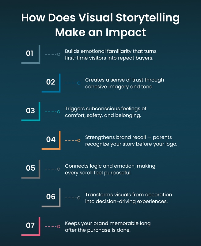
The human brain doesn’t process your visuals like a checklist; it experiences them like a sequence in a story. Each scroll should feel like turning a page — smooth, expected, reassuring. When that rhythm breaks, so does trust. But when your visuals stay consistent, they activate powerful emotional triggers in online shopping — nostalgia, safety, belonging — the feelings that turn passive browsers into active buyers.

A strong parent-focused design strategy doesn’t just show products; it shows values. When every visual speaks the same language — the lighting, the tone, the color warmth — it tells parents, “This brand gets me.” And once a parent feels understood, price stops being the deciding factor. Emotion takes over.

Consistency in storytelling doesn’t mean sameness; it means direction. It’s what keeps your visuals from being random content and turns them into recognizable chapters of one brand story — a story parents trust enough to keep buying into.

From Chaos to Calm: Steps to Build Visual Harmony That Parents Feel

Visual harmony isn’t a design luxury — it’s the foundation of emotional trust. The goal isn’t to make your baby store “look pretty”; it’s to make it feel right. When every element — from imagery to typography — syncs seamlessly, parents experience your brand as calm, reliable, and worth returning to. And the good news? Achieving that harmony isn’t a mystery. It’s a process.

Define a Visual Identity That Reflects Emotion, Not Just Aesthetics

Start by defining what emotion your brand should evoke: comfort, joy, safety, or belonging. Then translate it into cohesive brand imagery — consistent colors, fonts, and tone that mirror that feeling across every digital touchpoint. When your visuals align with emotion, design stops being cosmetic and starts being connective.

Align Imagery Tone Across Every Touchpoint

Your homepage, product photos, and ad creatives shouldn’t feel like they were shot on different planets. Align lighting, saturation, and tone so your visuals tell a single story. Parents subconsciously recognize consistency; it builds the emotional connection through design that keeps them scrolling, not second-guessing.

Audit for Inconsistencies — Mobile First

What looks great on desktop can fall apart on mobile. Audit your layouts, image ratios, and typography across devices. Parents shop on phones more than ever, and a visually inconsistent mobile experience silently kills trust faster than a slow checkout. Smooth transitions and balanced visuals are what create that sense of brand reliability.

Reinforce Emotional Storytelling in Every Visual

Every image should feel like part of your story, not an ad break. Whether it’s a lifestyle shot or a banner graphic, let it reflect your brand’s emotion and purpose. Authentic visuals — consistent in tone and intent — tell parents they’re part of something more than a transaction.

Build Consistency into Your Workflow

Consistency isn’t achieved once; it’s maintained. Use brand guidelines, shared design libraries, and checklists to keep every designer, photographer, and marketer aligned. This isn’t about control — it’s about clarity. When everyone speaks the same visual language, your brand speaks confidently too.

Conclusion

At the heart of every purchase is one quiet driver — reassurance. Parents don’t just buy baby products; they buy peace of mind. They’re not hunting for flashy websites or endless discounts. They’re searching for a brand that feels right the moment it loads. That’s where parent trust and visual design work hand in hand — not in pixels or prices, but in the emotions your store evokes.

Trust isn’t designed; it’s felt. It lives in your color harmony, your typography rhythm, your whitespace that breathes calm into chaos. Every consistent element tells a silent story — we care, we’re stable, we’ll deliver. That’s the true power of an emotional branding strategy: when your visuals stop selling and start reassuring.

Guided by this philosophy, the ZealousWeb team continues to help baby product eCommerce brands craft visual ecosystems parents instinctively believe in — experiences where emotional design and consistency turn trust into conversion. Our expertise in Shopify baby store UX transforms aesthetics into credibility, ensuring every scroll feels like confidence built, not a coincidence found.

Because when parents feel safe with your brand, they don’t just complete a purchase — they begin a relationship. And that relationship, nurtured through consistency and care, is what every great brand is built on.

UX Design Experience

FAQs

Related Blog Posts

Baby store website UX audit analysis

What Makes Regular UX Audits Non-Negotiable for Baby Store Survival?

February 27, 2026
Baby eCommerce UXDigital MarketingUX AuditWebsite Optimization
ZealousWeb

Why Lifestyle Photos Drive Higher Conversions in Baby eCommerce

February 27, 2026
Baby eCommerce MarketingeCommerce ConversionsLifestyle PhotographyProduct Image Optimization
parent shopping behavior

3 Things That Change Every Year in Parent Shopping Behavior

February 27, 2026
ecommerce trends 2025omnichannel shoppingparent shoppingparent shopping behavior
Checkout redesign conversion

Before vs After — The Checkout Redesign That Reduces Cart Abandonment

February 27, 2026
Cart AbandonmentCheckout RedesignEcommerce OptimizationUX/UI Strategy
Baby Store Design Mistakes

3 Design Mistakes That Make Baby Stores Look Untrustworthy

February 26, 2026
baby eCommerce storesbaby store designeCommerce StrategyeCommerce UX
Typography for baby store UX showing trust

Fonts That Parents Trust: Why Typography Matters in UX

February 26, 2026
baby store website designecommerce conversion designtypography in ecommerceUX for baby brands
Bounce rate in baby eCommerce

Bounce Rate Red Flags — What They Mean for Baby E-commerce

February 26, 2026
baby eCommerceBounce RateConversion OptimizationeCommerce UX
baby store conversions

Optimizing Product Pages for Better Engagement & Conversions

February 24, 2026
baby eCommercebaby product pagesbaby store conversionsproduct page optimization
Baby eCommerce technology

Why Founders Shouldn’t Try to “DIY” Their Baby Store Tech

February 23, 2026
baby eCommerceeCommerce Developmentstartup growth strategytechnology outsourcing