

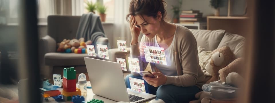
Your website might be selling baby products — but if it still looks like a baby, you’ve got a problem. Because in the world of baby eCommerce, “cute” doesn’t convert anymore — credible does. Parents today shop with one finger and a thousand doubts. The moment your site feels slow, outdated, or untrustworthy, they vanish — faster than your homepage carousel can load.
Here’s the truth no one likes to admit: a tired, old design quietly drains your sales every single day. Outdated eCommerce design doesn’t just look dull — it whispers the wrong story about your brand. To parents scrolling half-awake at 2 a.m., it says, “We’re behind. We’re risky. We’re not where modern parents shop.” And that’s all it takes for them to click away to a competitor who gets it.
Take the baby brand that finally faced this truth. They redesigned their store — modern visuals, mobile-first layouts, trust-building elements, and clearer calls to action. Within three months, their conversions doubled. No new product line, no aggressive ads — just a design that matched the expectations of today’s parents and the promise of their brand.
That’s the quiet power of great baby eCommerce website design: it doesn’t shout, it reassures. It makes parents feel safe, confident, and ready to buy. Because in this market, you’re not just selling pacifiers — you’re selling peace of mind.
Let’s dive deeper into how outdated design quietly sabotages your baby store’s conversions — and how a smarter, trust-first redesign can bring those numbers (and parents) back to life.
Outdated Isn’t Vintage: It’s Costing You Sales
Let’s get one thing straight — “vintage” only works for wine and denim, not your baby eCommerce store. If your website still loads like it’s buffering from 2010, you’re not nostalgic — you’re losing money.
Every slow scroll, laggy image, or confusing layout is another parent thinking, “Maybe I’ll come back later.” Spoiler: they won’t. In the baby product space, design equals trust — and when your store looks tired, it quietly tells parents your brand probably is too.
Parents shop with purpose, not patience. They’re comparing reviews, reading safety notes, and making decisions in seconds. If your store isn’t mobile-friendly, fast, and emotionally reassuring, they’ll bounce faster than a toddler after two spoonfuls of sugar. Because in eCommerce, you don’t lose sales to competitors — you lose them to friction.
Now let’s uncover the quiet culprits that make those sales disappear.
The Silent Killers of Conversion: Slow Checkout, Bad Visuals, Broken Trust Signals
A slow site is like a crying baby — it drives people away, fast.
What really kills your sales isn’t one big flaw, but a series of small, fixable ones:
- Slow checkout: Every extra click feels like a test of patience. Simplify it, and you instantly win trust.
- Weak visuals: Blurry photos, inconsistent colors, and dull product displays silently say, “We don’t pay attention to details.”
- Missing trust signals: No SSL badge, unclear return policies, or hidden shipping info — the moment parents feel uncertainty, they abandon the cart.
- Overcomplicated navigation: If finding a pacifier feels harder than finding peace during teething week, you’ve lost them already.
Each of these issues chips away at confidence — and confidence is the currency of conversions.
Why Design = Trust for Parents Shopping Baby Products
Parents aren’t buying a baby blanket; they’re buying peace of mind.
A well-structured, mobile-friendly baby store design tells them they’re in safe hands. Here’s why design builds instant credibility:
- Visual clarity = emotional safety. Clean layouts, soft tones, and balanced whitespace create calm, reassuring energy.
- Consistency = reliability. A cohesive look across your product pages signals professionalism and care.
- Responsiveness = respect. A smooth mobile experience shows you value their time — and their sanity.
Good design doesn’t just look trustworthy; it feels trustworthy. And feelings drive clicks far faster than logic ever will.
The Psychology Behind “I’ll Come Back Later” (They Never Do)
When a parent says, “I’ll come back later,” what they really mean is, “I didn’t feel confident enough to buy.”
That moment of hesitation happens because:
- The site looked outdated — triggering doubt.
- It loaded too slowly — breaking momentum.
- It lacked social proof — creating uncertainty.
- The checkout felt heavy — sparking decision fatigue.
And once that window closes, so does their intent. Because in eCommerce, “later” means “lost.”
What Parents Really See When They Land on Your Store
Here’s the thing — parents don’t shop like regular customers; they shop like guardians. They’re not just adding a baby bottle to the cart; they’re adding trust. The moment your website loads, their subconscious starts scanning for safety cues — colors, tone, photos, flow. If your design feels off, they don’t need to think twice. Their instinct whispers, “Not safe. Move on.”
Your baby eCommerce store isn’t just a sales platform; it’s your brand’s nursery. It should feel gentle, secure, and dependable — not cold or chaotic. Because parents don’t want a “wow” experience, they want reassurance. And if your baby brand visuals don’t convey that, no amount of discounts can save a lost sense of trust.
Let’s unpack how design shapes that emotional trust from the very first scroll.
Parents Don’t Shop — They Protect
When parents shop online, they aren’t browsing—they’re evaluating risk.
Every click is a small act of protection:
- They look for reassurance before reward. If your site feels pushy or visually cluttered, they tune out.
- They want safety over style. Flashy animations might impress, but warm, intuitive layouts make them believe.
- They read between the pixels. A gentle color palette, honest product images, and real testimonials make them think, “This brand cares.”
Emotional design for baby products starts here — with empathy, not aesthetics.
Why Outdated Design Triggers Doubt
The human brain takes 0.05 seconds to judge a website’s trustworthiness.
Outdated visuals instantly signal risk. Parents don’t consciously think, “This site is unsafe.” Their instincts simply do the math:
- Old layout = old security. They assume your checkout isn’t encrypted or updated.
- Unclear branding = weak credibility. If your logo or tone feels inconsistent, they question your legitimacy.
- Missing trust elements = immediate exit. No SSL badge, no social proof, no safety cue? They’re gone.
A baby product website trust isn’t earned with words — it’s designed into the experience.
How Colors, Fonts, and Product Imagery Influence Trust Subconsciously
Design psychology isn’t decoration — it’s decision-making science. Parents may not realize it, but their brains respond emotionally to visuals before they read a single word.
- Colors: Soft pastels (think blush, mint, or beige) convey calm and safety. Overly bold tones feel jarring in baby categories.
- Fonts: Rounded, clean typography signals friendliness and care; harsh or condensed fonts feel commercial and distant.
- Images: Real babies, real parents, natural light — authenticity sells. Stock-photo perfection? Not so much.
It’s subtle but powerful — these design cues build comfort at a subconscious level. In emotional design for baby products, trust begins with tone before text.
Mobile or Bust: The Scroll Test Every Baby Store Fails
Let’s be real — most of your customers aren’t shopping from a desk; they’re shopping from the chaos. One hand is rocking the baby, the other is scrolling at 1 a.m., hoping to buy something before the next diaper change. If your site doesn’t load smoothly, resize correctly, or respond instantly, that purchase is gone before the lullaby ends.
A mobile-friendly baby store design isn’t just “nice to have” anymore — it’s your entire sales funnel. Parents don’t wait for slow sites, they don’t pinch and zoom, and they definitely don’t fill ten checkout fields with one thumb. If your design doesn’t pass the scroll test — the ability to shop, browse, and buy effortlessly on mobile — you’re losing conversions by the minute.
Here’s what separates a sleep-deprived browser from a confident buyer.
Why Responsive Design Isn’t Optional Anymore
Because your desktop design doesn’t pay the bills — your mobile one does.
Parents expect baby product websites to feel as easy as ordering a cab or food. When they don’t, frustration kicks in faster than you can say “page not found.”
- Over 75% of baby product shoppers browse on mobile.
- If your layout breaks, buttons overlap, or images crop awkwardly, credibility collapses.
- A responsive baby website UX isn’t about resizing — it’s about rethinking how parents interact under pressure.
Think touch-first navigation, thumb-friendly buttons, and concise copy that doesn’t require zooming. It’s design empathy in action — and it directly fuels trust and conversions.
The 3-Second Rule: How Speed Kills or Saves Your Conversion Rate
In baby eCommerce, every second is a scroll closer to “no thanks.”
If your store takes more than three seconds to load, here’s what happens next:
- After 3 seconds: Bounce rate jumps 30%.
- After 5 seconds, 50% of mobile users leave.
- After 10 seconds: You’ve officially lost them to a faster competitor.
Parents don’t multitask by choice — they multitask by necessity. Optimizing product pages for parents means trimming unnecessary animations, compressing images, and caching like your sales depend on it (because they do). Fast feels reliable. And reliability is the new luxury in baby eCommerce.
Mobile UX Sins You Didn’t Know You Were Committing
You might think your site is “fine,” but let’s test that optimism. These silent UX mistakes are probably scaring away more parents than you realize:
- Text that’s too small: If they have to squint, they’ll skip.
- Tiny CTAs: Buttons need to be tappable, not target practice.
- Pop-ups gone wild: Interrupting checkout for a “subscribe now” plea is UX sabotage.
- Endless scrolling: Parents don’t have time to scroll through an infinite toy aisle — simplify it.
- Hidden essentials: Pricing, return policy, and shipping info shouldn’t be a treasure hunt.
A great mobile-friendly baby store design doesn’t just fit smaller screens — it fits smaller attention spans.
The Checkout Gauntlet: Where Most Sales Die Quietly
Let’s be honest — no parent wants to feel like they’re applying for a home loan just to buy a pacifier. Checkout is where the battle for conversions is won or lost. It’s the final stretch, yet most baby stores treat it like a paperwork marathon — too many fields, too few reassurances, and far too much friction.
Here’s the truth: every extra click feels like resistance. And when you’re selling to sleep-deprived parents, resistance kills intent faster than a 2 a.m. cry. Optimizing baby eCommerce checkout for parents isn’t about fancy plugins; it’s about empathy — removing the small annoyances that push them from “ready to buy” to “maybe later.”
Let’s break down the key fixes that turn abandoned carts into completed checkouts.
Simplifying Checkout = Instant Trust Gain
A short, clean checkout experience is the digital equivalent of saying, “We’ve got you.”
Parents don’t want to “sign up,” “verify,” or “confirm” a dozen times — they just want to finish and move on.
- Cut the clutter. Only ask for what you truly need — name, address, payment. Everything else can wait.
- Show progress. A visual step bar or “Almost done” message calms the buying anxiety.
- Keep auto-fill enabled. Parents love convenience more than discounts.
- Highlight safety. Payment security icons and trust seals reduce hesitation in seconds.
Simplify, reassure, and let them buy without friction. Because convenience is conversion.
Guest Checkout vs. Account Creation for Parents, And Which Converts Better
Let’s settle this: guest checkout wins — every time.
When parents are in a hurry, the last thing they want is to remember another password.
- Guest checkout = speed and relief. It’s the low-commitment option that builds trust through freedom.
- Forced account creation = frustration. It feels pushy, not personal.
- Smart compromise: Offer to “save details for next time” after purchase — not before.
It’s simple psychology. Give freedom first, and you earn loyalty later. That’s real baby store CRO in action.
Add-to-Cart vs. Add-to-Regret: How Bad UX Destroys Good Intent
When parents click “add to cart,” they’ve already said yes. Bad UX just makes them regret it. You don’t need analytics to know when checkout design is killing conversions — you need empathy.
- Unexpected shipping costs: The #1 reason for cart abandonment. Show it upfront.
- Distracting upsells: A pop-up mid-checkout feels like an interruption, not an upgrade.
- Unclear CTAs: “Proceed” or “Continue” isn’t clear — “Place Order” is.
- No reassurance: No reviews, no delivery info, no return policy in sight — just silence.
Each micro-friction adds doubt, and doubt breaks trust. In eCommerce conversion optimization for baby products, trust is your biggest currency — not your coupon codes.
Future-Proofing Your Baby Store Because Trends Grow Up Fast
The only thing that changes faster than baby fashion? Design trends in eCommerce. You don’t want to spend months perfecting your store only for it to feel outdated by the next quarter. Parents today expect digital experiences that evolve as quickly as their kids do. Staying ahead of design shifts isn’t vanity — it’s survival. Because the brands that adapt fastest convert longest.
Future-proofing your baby store means building with longevity — design systems that scale, tech stacks that flex, and experiences that still feel modern next year (and the one after). Let’s look at what separates a “now” design from a next-generation one.
Design Trends That Will Define 2025 Baby eCommerce
The modern parent’s buying journey is driven by emotion and efficiency. The baby eCommerce design trends for 2025 blend both — less clutter, more clarity.
- Warm minimalism: Clean layouts, soft gradients, and organic textures replace loud, colorful chaos.
- Humanized visuals: Real families over stock photos — storytelling through authenticity.
- Soothing motion design: Subtle animations that guide attention, not distract it.
- Trust through transparency: Clear shipping, eco-friendly sourcing, and visible brand ethics.
- Micro-personalization: Tailored recommendations that feel thoughtful, not intrusive.
These modern UI trends for baby brands don’t just look good — they feel good, which is exactly what parents buy into.
Integrating Personalization, AR Previews, and Sustainability Cues
Parents want to see, feel, and believe before they buy — and technology finally makes that possible.
- Personalization: Smart algorithms that remember browsing history and recommend relevant baby essentials create a “you get me” experience.
- AR previews: Allow parents to visualize cribs or strollers in their homes — it turns hesitation into confidence.
- Sustainability cues: Highlight eco-friendly materials, ethical sourcing, and recyclable packaging directly in product cards — it builds emotional loyalty.
It’s not just about optimizing baby store conversions — it’s about optimizing connection.
Continuous Testing = Continuous Trust
The baby market evolves daily — your store should too. The most successful brands never assume they’ve “figured it out.” They test, tweak, and test again.
- A/B test product layouts to see what drives more clicks.
- Experiment with headlines and imagery that spark emotional engagement.
- Measure micro-interactions — where users pause, hesitate, or drop off — and fix those friction points.
Every small optimization compounds into credibility. Continuous testing isn’t about chasing trends — it’s about maintaining trust and consistency.
Your baby eCommerce design shouldn’t just look modern — it should age gracefully. Because in a market where trust is emotional and loyalty is fleeting, the best future-proof strategy is simple: keep evolving before your customers outgrow you.
TL;DR: If Parents Don’t Trust Your Design, They Don’t Buy
Let’s call it what it is — your products might be adorable, but your design? Not always as cute. Parents don’t judge your brand on your baby clothes or toys first; they judge it on how safe your website feels. And if that safety isn’t crystal clear, they won’t stick around long enough to find out how great your products are.
Every unclear CTA (“Proceed” instead of “Place Order”), every missing review, every invisible return policy silently chips away at trust. Those small UX cracks don’t just hurt your aesthetics — they break your conversions. Because when a parent hesitates, they don’t email you about it; they just leave.
That’s the harsh truth of eCommerce conversion optimization for baby products — you don’t lose sales to competitors; you lose them to doubt. And doubt is born from bad design.
In baby eCommerce, trust isn’t earned through discounts or fancy banners — it’s earned through design that feels safe, warm, and human. Checkout should be a sigh of relief, not a test of endurance. Because when every click feels effortless, parents don’t second-guess; they complete. So before you chase the next ad campaign or influencer collab, look at your design. It’s not just your storefront — it’s your silent salesperson. And if that design doesn’t look trustworthy, your customers won’t buy the story you’re selling.
Need a Baby Store That Grows Up Too?
A baby store can’t rely on “cute” forever. Parents today buy from brands that feel secure, effortless, and emotionally reassuring — not just visually pleasing. Every scroll, click, and product image plays a quiet role in building trust. And that’s where design maturity truly matters.
When strategy meets empathy, Shopify baby store design evolves into something far greater — a journey parents can believe in. A well-structured, emotionally intelligent layout doesn’t just optimize conversions; it earns loyalty.
Guided by the experience of ZealousWeb, brands across the globe have reimagined their online baby stores with designs that don’t just attract — they assure. Because in the end, the difference between a store that sells and one that succeeds is simple: trust, thoughtfully designed.

FAQs
How Do I Know If My Baby’s eCommerce Store Really Needs a Redesign?
If traffic is steady but conversions are low, your design may be working against trust. Parents make emotionally driven decisions, and if your store doesn’t feel credible, mobile-friendly, or easy to navigate at first glance, a redesign is likely needed.
What Makes ZealousWeb Different from Other E-Commerce Agencies?
ZealousWeb goes beyond just redesigning websites. We combine user psychology, conversion strategy, and creative design to build e-commerce stores that not only look appealing but also drive higher engagement and sales.
Can You Work on Our Existing Shopify or WooCommerce Setup?
Yes. We optimize and customize existing platforms without disrupting live operations, improving UX, performance, and trust signals for smoother conversions.
How Long Does It Take to See Results After a Redesign?
Most brands see measurable gains—such as higher engagement and improved checkout completion—within 30 to 90 days, once analytics and conversion tracking are aligned.
Do You Handle Both Design and Development?
Yes. We provide end-to-end eCommerce services, including UI/UX design, theme customization, speed optimization, mobile responsiveness, and ongoing maintenance.
What Kind of Budget Should I Expect for a Baby eCommerce Redesign?
Budgets vary by platform, complexity, and scope. We offer flexible proposals, from phased UX improvements to full rebuilds, aligned with your goals and growth stage.
How Does ZealousWeb Ensure My Store Builds Parent Trust?
Through research-driven design—authentic imagery, calm color psychology, secure checkout flows, and clarity at every touchpoint. In baby eCommerce, trust is the strongest conversion driver.


