ZealousWeb
poor mobile UX

How Poor Mobile UX Shows It’s Time for a Revamp

December 11, 2025Posted By: Jalpa Gajjar
eCommerce Mobile ExperienceeCommerce UXMobile-First DesignUX Audit

Your mobile site isn’t broken — it’s just quietly turning away customers while you’re busy checking analytics.

It loads a second too slow, the buttons are half-hidden under the thumb, and the checkout feels like a test of patience rather than trust. That’s poor mobile UX — the silent sales killer most businesses mistake for “minor glitches.” And while you’re wondering why traffic looks healthy but conversions don’t, your users are already gone, swiping toward someone who respects their time.

Bad user experience doesn’t scream; it whispers. It drains your marketing budget pixel by pixel. You can pour thousands into ads, SEO, and content, but if your mobile journey frustrates users, all that effort goes down the digital drain. Studies keep proving it — a one-second delay can drop conversions by over 30 percent. That’s not a tech problem; that’s a growth problem disguised as design.

Here’s the truth: modern users don’t compare you to your competitors — they compare you to their last seamless experience. When every brand promises “fast, easy, and responsive,” your website doesn’t get points for loading; it’s judged by how quickly it earns trust. Those tiny friction points — hard-to-tap menus, unreadable text, laggy pages — are the silent leaks in your conversion funnel that no amount of marketing can fix.

If your mobile experience feels like a puzzle instead of a path, it’s time to rethink what your brand really communicates. Because users aren’t patient anymore; they’re powerful. And when their first impression hurts, your next campaign has already lost.

Let’s talk about what those pain points look like — and why your mobile site might feel more like a maze than a smooth journey.

When Your Mobile Site Feels Like a Maze

You know that moment when you’re on a mobile site, you tap a button, and instead of moving forward, the page decides to freeze — like it’s buffering your patience? That’s bad UX at its most familiar form. From menus that disappear faster than your Wi-Fi signal to text so small it could double as fine print, cluttered mobile design has turned browsing into a workout for your thumbs.

The problem isn’t that users don’t want to buy; it’s that they can’t figure out how. Every extra scroll, misplaced icon, or lagging form field adds another reason to bounce. And if your responsive layout errors make people zoom, pinch, and rage-tap their way through checkout, congratulations — you’ve just created an obstacle course, not a user journey.

Below are some telltale signs your mobile site feels more like a maze than a modern experience:
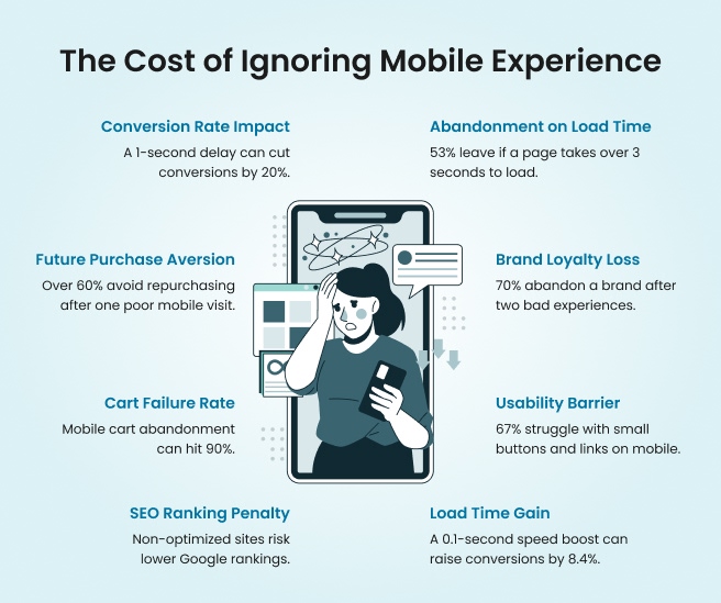
Mobile UX Problem How It Feels To Users Why It Hurts You
Menus vanish mid-scroll “Did I just break the site?” Users can’t navigate, so they leave
Buttons too tiny to tap “Am I supposed to have toddler fingers?” Frustration kills conversions
Pages load too slowly “I’ll never come back.” High bounce rates, low retention
Cluttered mobile design “What do I click first — or at all?” Visual chaos confuses intent
Touch navigation problems “Why does the back button open a pop-up?” Poor control breaks trust
Responsive layout errors “Why is the image covering the text?” Broken layouts signal poor quality


When your website feels more like a puzzle than a pathway, it’s not the user’s fault — it’s your signal to simplify. Because in mobile UX, every tap should feel effortless, not exhausting. And the next step? Learning what those hidden metrics are trying to tell you — because the numbers don’t lie, they just expose what your users already know.

Mobile experience

Metrics Don’t Lie — They Just Hurt

There’s no polite way to say this — your metrics are tattling on you. They’re showing every flaw your mobile UX has been trying to hide behind pretty visuals and paid campaigns. Bounce rates climbing? That’s not “seasonal behavior”; it’s your users fleeing faster than your analytics can record them.

Dwell time dropping? That’s your visitors deciding they’d rather spend their screen time somewhere that doesn’t make them pinch and zoom like digital archaeologists. And if your cart abandonment rate is higher than your Wi-Fi signal, you’ve got a UX problem, not a marketing one.

When it comes to mobile conversion optimization, the data speaks louder than any design award. The numbers aren’t abstract — they’re a mirror of user frustration.

  • High Bounce Rate: If most users exit after viewing one page, your mobile layout likely confuses or overwhelms them. For example, an eCommerce homepage cluttered with banners may look “busy” but feel impossible to navigate on a 6-inch screen.
  • Short Session Duration: When visitors spend less than 20 seconds per page, it signals content is either unreadable or irrelevant. Maybe the font is microscopic, or your call-to-action hides below the fold — either way, they’re not sticking around.
  • Low Conversion Rate: You’ve done the marketing, but your checkout form asks for a blood type and ZIP code twice. Every unnecessary step adds friction.
  • Cart Abandonment Spikes: That last page before payment is your brand’s moment of truth. If it’s slow, glitchy, or forces users to create an account, expect exits, not orders.
  • Rising Exit Rate on Key Pages: When your About or Pricing pages see high exits, it’s not just content — it’s design. Users can’t find what they came for, so they quit the journey altogether.
  • Poor Mobile Engagement Metrics: Scroll depth under 30%? That means people aren’t scrolling past the first few lines. Time to rethink visual hierarchy and load speed.

Think of your analytics as a health report — each number is a symptom, not a sentence. You can fix what’s broken, but only if you stop blaming your ads and start listening to your data. Because every percentage drop is a user who almost stayed.

And here’s the kicker — those metrics don’t just impact conversions; they directly affect your search rankings too. Google reads them as user satisfaction signals. Which means, if your mobile experience frustrates users, your SEO suffers twice — once when they leave, and again when Google notices they did.

So before you push another campaign live, take a hard look at your numbers. They’re not your enemies — they’re warning signs. And next, let’s address one of the biggest misconceptions in mobile UX — that being “responsive” is enough to keep users happy.

“It’s Responsive” Isn’t the Compliment You Think It Is

Saying your website is responsive is like bragging that your car has wheels — it’s the bare minimum. Responsiveness doesn’t guarantee a good experience; it only means your site fits on a screen, not that it feels good to use. A responsive layout might look fine when resized, but if users still struggle to read, tap, or complete a task, you’ve fixed dimensions, not design.

The truth is, mobile-first UX is more than resizing — it’s rethinking. It’s about making sure every scroll, click, and swipe feels natural. Users want clarity, speed, and comfort. And if your “responsive” site still hides CTAs, squeezes text, or ignores accessibility, it’s not user-friendly; it’s just politely broken.

Let’s unpack what separates a truly seamless experience from a “shrunk-down” version of your desktop site.

A Site That Fits Isn’t a Site That Flows

Most responsive designs treat mobile like a smaller version of desktop, not a separate experience. The result? Pages that technically “fit” but feel cluttered, misaligned, and hard to follow. A mobile-first UX approach starts from the smallest screen and scales up — not the other way around. It prioritizes finger reach, reading patterns, and vertical hierarchy.

For example, a navigation bar with five equal buttons might look balanced on a desktop but turns into a tiny text soup on mobile. Users end up zooming, scrolling sideways, or abandoning the site altogether. True responsiveness doesn’t just shrink — it simplifies.

Usability Isn’t Optional — It’s the Experience

A site can’t be considered responsive if users can’t comfortably use it. Mobile usability means frictionless actions — buttons that respond instantly, menus that stay stable, and forms that don’t require pinch gestures to complete.

Think of it this way: your design should anticipate errors, not create them. For instance, spacing between clickable elements should respect the thumb zone — where real users actually tap. A layout that forces constant scrolling or misclicks isn’t usable; it’s exhausting.

A mobile usability checklist should go beyond aesthetics: test your navigation flow, tap zones, content hierarchy, and load consistency. Because beauty without usability is like a luxury car without brakes — looks great, performs terribly.

Accessibility Builds Trust Faster Than Aesthetics

Accessibility isn’t just compliance — it’s good business. A mobile site that’s accessible ensures everyone, regardless of ability, can navigate and engage. That means proper contrast ratios, readable fonts, voice compatibility, and clear alt text.

Ignoring accessibility in mobile UX doesn’t just alienate a segment of your audience; it signals carelessness. In a world where inclusivity shapes brand reputation, accessible design builds credibility faster than visual polish ever could. When users feel seen and supported, trust grows — and trust is the real metric of successful UX.

Visual Hierarchy — The Secret Architecture of Engagement

Even the best visuals fail if users can’t find what matters. On mobile, attention spans shrink, and every scroll competes for focus. Visual hierarchy ensures your most important elements — headlines, CTAs, prices — appear where the eye naturally lands first.

For instance, a CTA buried below three banners or sliders may never be seen. The hierarchy should guide the user’s journey like a well-lit path — not a scavenger hunt. Use size, contrast, and spacing strategically to draw focus, and watch how it transforms behavior.

Good UX doesn’t just look ordered — it feels intuitive. And when users don’t have to think, they act. Because a responsive site might work, but a well-designed one wins. And if your current layout only passes the “looks okay” test, it’s time to ask whether it’s serving users — or just surviving screens.

Red Flags That Scream “Revamp Me”

Saying your website is responsive is like bragging that your car has wheels — it’s the bare minimum. Responsiveness doesn’t guarantee a good experience; it only means your site fits on a screen, not that it feels good to use. A responsive layout might look fine when resized, but if users still struggle to read, tap, or complete a task, you’ve fixed dimensions, not design.

The truth is, mobile-first UX is more than resizing — it’s rethinking. It’s about making sure every scroll, click, and swipe feels natural. Users want clarity, speed, and comfort. And if your “responsive” site still hides CTAs, squeezes text, or ignores accessibility, it’s not user-friendly; it’s just politely broken.

Let’s unpack what separates a truly seamless experience from a “shrunk-down” version of your desktop site.

A Site That Fits Isn’t a Site That Flows

Most responsive designs treat mobile like a smaller version of desktop, not a separate experience. The result? Pages that technically “fit” but feel cluttered, misaligned, and hard to follow. A mobile-first UX approach starts from the smallest screen and scales up — not the other way around. It prioritizes finger reach, reading patterns, and vertical hierarchy.

For example, a navigation bar with five equal buttons might look balanced on a desktop but turns into a tiny text soup on mobile. Users end up zooming, scrolling sideways, or abandoning the site altogether. True responsiveness doesn’t just shrink — it simplifies.

Usability Isn’t Optional — It’s the Experience

A site can’t be considered responsive if users can’t comfortably use it. Mobile usability means frictionless actions — buttons that respond instantly, menus that stay stable, and forms that don’t require pinch gestures to complete.

Think of it this way: your design should anticipate errors, not create them. For instance, spacing between clickable elements should respect the thumb zone — where real users actually tap. A layout that forces constant scrolling or misclicks isn’t usable; it’s exhausting.

A mobile usability checklist should go beyond aesthetics: test your navigation flow, tap zones, content hierarchy, and load consistency. Because beauty without usability is like a luxury car without brakes — looks great, performs terribly.

Accessibility Builds Trust Faster Than Aesthetics

Accessibility isn’t just compliance — it’s good business. A mobile site that’s accessible ensures everyone, regardless of ability, can navigate and engage. That means proper contrast ratios, readable fonts, voice compatibility, and clear alt text.

Ignoring accessibility in mobile UX doesn’t just alienate a segment of your audience; it signals carelessness. In a world where inclusivity shapes brand reputation, accessible design builds credibility faster than visual polish ever could.

When users feel seen and supported, trust grows — and trust is the real metric of successful UX.

Visual Hierarchy — The Secret Architecture of Engagement

Even the best visuals fail if users can’t find what matters. On mobile, attention spans shrink, and every scroll competes for focus. Visual hierarchy ensures your most important elements — headlines, CTAs, prices — appear where the eye naturally lands first.

For instance, a CTA buried below three banners or sliders may never be seen. The hierarchy should guide the user’s journey like a well-lit path — not a scavenger hunt. Use size, contrast, and spacing strategically to draw focus, and watch how it transforms behavior.

Good UX doesn’t just look ordered — it feels intuitive. And when users don’t have to think, they act.

Because a responsive site might work, but a well-designed one wins. And if your current layout only passes the “looks okay” test, it’s time to ask whether it’s serving users — or just surviving screens.

Redesign Isn’t Cosmetic — It’s Conversion Therapy

A redesign isn’t a facelift — it’s therapy for your conversions. When brands treat UX revamps like a beauty project, they miss the real win: strategy. A smart mobile UX redesign isn’t about prettier gradients or trendier fonts; it’s about rebuilding trust, simplifying journeys, and eliminating the friction that keeps users from clicking “buy.” Because let’s be honest — no one abandons a checkout because the button wasn’t stylish enough. They leave because it didn’t work fast enough.

Every redesign should start with a diagnosis, not decoration. When done right, it fixes what analytics can’t always explain — the subtle frustrations users don’t complain about but feel instantly. Think of it as conversion therapy for your brand: reducing anxiety, increasing comfort, and guiding users toward decisions with zero resistance.

Here’s a simple example. A fashion retailer we worked with had a gorgeous website that looked award-worthy — until we checked the data. Mobile bounce rates were 63%, and average session duration barely crossed 18 seconds. Post-redesign, with a cleaner layout, thumb-friendly menus, and faster loading pages, conversions jumped by 38% within two months. The design didn’t just look better — it started earning better.

That’s the ROI of better UX — when every interaction feels natural, users stop second-guessing and start trusting. The reward isn’t compliments on aesthetics; it’s measurable growth in sales, engagement, and retention.

Your brand doesn’t need a redesign to look relevant; it needs one to stay believable. Because the moment your mobile experience feels outdated, users assume your service is too.

The Revamp Roadmap — How We Fix What’s Broken

Redesigns shouldn’t feel like rocket science — they should feel like relief. A mobile site revamp doesn’t start with color palettes or fancy prototypes; it starts with understanding what’s broken and why users are quietly walking away. The secret lies in having a clear, transparent UX redesign process that balances creativity with data. When done right, it turns confusion into clarity and browsers into believers.

Here’s how our team approaches a seamless UX improvement plan — not with guesswork, but with structure that actually works.

Step What We Do Why It Matters
UX Audit & Research We analyze user behavior, session recordings, and mobile heatmaps to see where people drop off. It identifies friction points that analytics alone can’t explain.
Data-Backed Insights We interpret metrics like bounce rate, scroll depth, and conversion flow to guide the redesign direction. It ensures every change has a purpose — not just personal preference.
Design Strategy & Wireframing We craft user-first layouts that prioritize clarity, tap comfort, and thumb reach. A design built around human interaction keeps users moving forward.
Prototyping & Testing Interactive prototypes go through multiple usability rounds before the actual build. Real users validate what works before you invest in final development.
Development & Optimization We implement the new experience with speed-focused coding and cross-device consistency. Because a design that looks great but loads slowly isn’t really optimized
Launch & Continuous Monitoring Post-launch, we monitor engagement metrics and make iterative improvements. UX isn’t a one-time fix — it’s a living system that evolves with your audience.


Every phase of this roadmap is about removing obstacles, not adding complexity. The goal is simple — make the user journey so effortless that conversions become a natural outcome. That’s how great UX agencies don’t just improve mobile experience — they rebuild confidence, step by step. And now that you know what goes into fixing what’s broken, it’s time to see why waiting too long to act can cost more than a redesign ever will.

Conclusion

A poor mobile experience doesn’t make a sound — it just quietly drains trust, one frustrated tap at a time. Users won’t tell you what went wrong; they’ll simply move on to a site that feels faster, cleaner, and easier. And that’s how businesses lose not just traffic, but credibility.

Redesigns aren’t vanity projects; they’re confidence rebuilders. When your site flows effortlessly, every tap communicates reliability, every scroll strengthens the connection, and every second spent feels valuable. That’s the real outcome of a thoughtful mobile site revamp — not just higher conversions, but higher trust.

Guided by data, empathy, and precision, the team at ZealousWeb creates digital experiences that feel as natural as they look. Because the goal isn’t just to improve mobile website experience — it’s to help your brand earn belief with every interaction.

Your users have already decided what “good” feels like. The only question is — does your site cut?

baby store

FAQs

How do I know if my mobile site really needs a UX redesign?

What makes ZealousWeb’s UX redesign approach different from other agencies?

How long does a mobile UX redesign project take?

Will redesigning my mobile site affect my SEO or existing traffic?

Do I need a full redesign or just UX optimization?

How do you measure the success of a UX redesign?

What kind of businesses can benefit from ZealousWeb’s mobile UX redesign services?

How do I get started with ZealousWeb’s UX redesign process?

Will I be involved during the redesign process?

What results can I expect after partnering with ZealousWeb for a mobile UX redesign?

Related Blog Posts

build a profitable baby store

How to Build a Profitable Online Baby Store Without Tech Headaches

December 10, 2025
baby eCommerceeCommerce StrategyShopify Baby Store TipsUI UX for baby stores
baby store UX revamp

Signs Your Baby Store Needs a UI/UX Revamp: The Definitive Guide

December 04, 2025
baby eCommerceeCommerce UXUI/UX auditUX redesign
baby store website design tips

Trust-Building Through Design — How Baby Stores Win Parents’ Confidence

December 02, 2025
baby eCommercedesign psychologyTrust BuildingUI/UX design
UI/UX strategies for baby ecommerce

Proven UI/UX Strategies That Boost Baby Store Revenue

December 01, 2025
baby eCommerceConversion OptimizationeCommerce GrowthUI/UX design
UX/UI design for baby ecommerce

The Role of UX/UI Design in Driving Growth and Customer Loyalty in Baby Ecommerce Stores

November 26, 2025
baby eCommerceeCommerce GrowthUser ExperienceUX/UI Design
baby product stores

Why Most Baby Product Stores Fail (And How to Avoid It)

November 25, 2025
baby eCommercebaby product store designeCommerce conversion optimizationtrust building for baby brands