


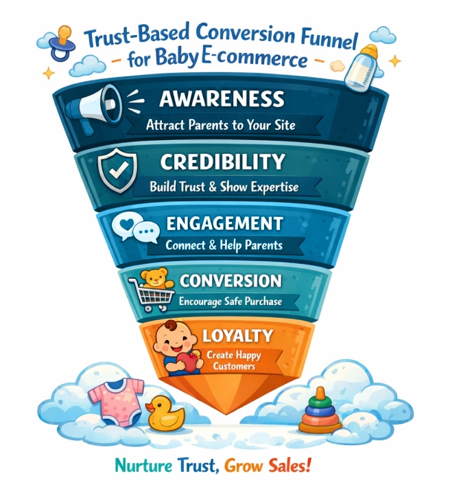
Your analytics dashboard tells the same frustrating story every week — plenty of visitors, hardly any buyers. You’ve invested in ads, created detailed product pages, and maybe even run discounts. Yet conversions stay stubbornly low. The truth? Parents aren’t leaving because your products aren’t good enough — they’re leaving because they don’t trust you yet.
For parents, shopping for baby essentials online isn’t just another purchase — it’s a decision layered with emotion, caution, and responsibility. A baby bottle isn’t just plastic; it’s safe. A stroller isn’t just a product; it’s comfort and security. When your website fails to prove that it’s safe, authentic, and reliable, their instinct is to click away — no matter how beautiful your catalog looks.
On the business side, most baby eCommerce sites unknowingly send the wrong signals: missing customer reviews, unclear return and shipping policies, generic imagery, and no visible safety assurances. These small gaps create one big perception — uncertainty.
In baby eCommerce, trust is the real currency of conversion. Parents don’t buy what they can’t believe in. And until your store communicates that credibility through design, content, and reassurance, even the most traffic-rich site will stay profit-poor.
Because the truth is — parents don’t abandon their cart. They abandon uncertainty.
The Hidden Problem: Your Store Feels Unsafe, Not Unseen
It’s easy to assume your baby store isn’t growing because it lacks visibility — but most parents who find your site still don’t buy. The real reason goes deeper: your store doesn’t feel trustworthy. In baby eCommerce, perception is everything — and when trust is missing, even the best products struggle to sell.
When Visibility Isn’t the Real Issue
Many baby eCommerce owners equate “no sales” with “no reach.” But often, the issue isn’t discoverability — it’s credibility. Parents are landing on your site; they’re just not staying. Why? Because the website doesn’t communicate the safety, authenticity, and reliability they expect when shopping for their little one.
Your store might look modern, but if it fails to provide instant emotional reassurance, parents leave before exploring further. In the baby niche, the question isn’t “Do they see you?” — it’s “Do they trust you enough to stay?”
Fear Is the Silent Deal-Breaker
Parents don’t walk away from your store because they found cheaper prices elsewhere. They walk away because of fear. Fear that the product might not be genuine. Fear that the payment process isn’t secure. Fear that if something goes wrong, they won’t find support.
When your baby store lacks the essentials of trust — verified reviews, visible safety badges, clear refund policies, or credible contact information — parents subconsciously interpret it as unsafe. And in an emotionally sensitive category like baby products, fear outweighs interest every single time.
It’s not the lack of visitors that hurts conversions — it’s the lack of assurance.
How to Turn Fear into Confidence
The only way to convert parents is to make them feel safe before they spend. Building trust isn’t a design trick — it’s a communication strategy rooted in transparency.
Here’s how to rebuild confidence on your baby’s eCommerce website:
- Show authentic reviews and real customer photos. Let new parents see proof from other families.
- Display security indicators — SSL certificates, trusted payment logos, and checkout protection badges.
- Be open about your policies. Make refunds, exchanges, and delivery timelines easy to find and clearly stated.
- Humanize your brand. Replace stock images with warm, real visuals that reflect your brand’s tone and parent-first approach.
- Highlight quality guarantees or certifications. Parents notice these micro-details before they even notice pricing.
Each of these elements acts like a quiet promise: “We care as much as you do.” When parents believe that, fear turns into trust — and trust into sales.
Because the truth is, your biggest obstacle isn’t competition. It’s the doubt that your store is safe enough for their baby.
Parents Don’t Buy What They Don’t See — Visibility Gaps That Kill Sales
Your store can have the best baby products in the market, but if parents can’t find you, they can’t trust you. Visibility isn’t just about ranking on Google; it’s about appearing in the right searches, speaking the right language, and showing up where your ideal buyers are looking. Without visibility, credibility never even gets the chance to exist.
The Silent Struggle of Invisible Stores
Many baby eCommerce owners assume visibility is a technical problem — something SEO alone can fix. But visibility is about discoverability and positioning. Parents use specific, intent-driven searches like “organic baby wipes near me” or “non-toxic baby bottles India.” If your product pages and content don’t mirror these phrases, your site remains invisible, even to the right audience.
It’s not that your products are bad; it’s that your store never enters the parents’ consideration set. Visibility is not optional in eCommerce — it’s the foundation of trust. Parents can’t believe in a brand they’ve never seen.
Visibility Gaps That Quietly Kill Conversions
Most baby stores unknowingly suffer from a few recurring visibility leaks. These are small issues that collectively make your brand hard to find — and even harder to trust.
Here’s a breakdown of what causes those gaps and how to fix them:
| Visibility Gap | What’s Going Wrong | How It Impacts Your Store | Quick Fix |
| Weak keyword targeting | Product titles and descriptions don’t include parent-search phrases. | Your store doesn’t appear for high-intent keywords like “safe baby lotion.” | Research and add long-tail, parent-focused keywords. |
| No blog or content strategy | You only sell — you don’t educate. | Parents never find your site while researching baby products. | Create blogs, guides, and checklists around parenting needs. |
| Missing schema markup | Search engines can’t identify product info correctly. | Your listings lack ratings, prices, and trust signals in search results. | Add Product, Review, and Breadcrumb schema tags. |
| Poor mobile optimization | The mobile view loads slowly or looks untrustworthy. | 70% of parents shop on mobile; poor UX = instant drop-off. | Test your site speed and simplify checkout for mobile. |
| No local visibility | You’re missing Google Business Profile or local listings. | Parents nearby can’t find you when searching “baby store near me.” | Claim and optimize your local Google listing. |
These issues don’t just block traffic — they silently erode confidence. When your store doesn’t show up where parents are looking, it subconsciously feels “less legitimate.”
How Visibility Builds Trust and Sales Together
In the baby niche, visibility and trust go hand in hand. Parents rarely buy from the first store they see — they buy from the one they see repeatedly. Consistent online presence through blogs, search rankings, social media posts, and review platforms makes your brand feel established.
To strengthen both visibility and credibility:
- Invest in SEO content that answers parents’ real questions.
- Use Google Search Console and GA4 to monitor which pages attract parents most.
- Post regularly on social platforms where parents interact — especially Instagram and Pinterest.
- Collaborate with micro-parenting influencers to extend organic reach.
Visibility is trust’s first impression. When parents see your brand often — with helpful content and credible visuals — they start believing in it, even before making a purchase.
The Experience Test: When Design Pushes Parents Away
Your store might have the right products, pricing, and traffic — but a poor user experience can quietly destroy conversion potential. In baby eCommerce, design is more than aesthetics; it’s emotional reassurance. Parents don’t just evaluate your site — they feel it. And when the experience feels cluttered, confusing, or unsafe, they leave long before checkout.
The Checkout That Killed Trust (Before → After)
Here’s how small UX mistakes create big trust problems — and what the improved version looks like:
| Before (Poor UX Experience) | After (Optimized for Trust & Comfort) |
| Overloaded homepage with multiple banners and distractions | Clean layout with one focused message and soft pastel tones |
| Inconsistent product photos and unclear sizing | Consistent imagery, clear size charts, and zoom-enabled visuals |
| Checkout requires too many steps, and hidden fees appear late | One-step transparent checkout with visible delivery costs |
| No trust badges, unclear SSL status, or outdated icons | Prominent secure payment icons, SSL padlock, and return guarantee |
| Generic “Buy Now” buttons with no emotions | Action buttons paired with reassurance copy like “Safe & Secure Checkout” |
Takeaway: The difference between a bounced visit and a completed order often comes down to how “safe” your site feels at checkout.
The Parents’ Journey: From Hope to Hesitation to Exit
Here’s what’s happening in real time when a new parent visits your site:
- First 3 seconds: They scan — does it look trustworthy?
- Next 10 seconds: They navigate — is it easy to find what I need?
- Final moment: They decide — do I feel confident enough to buy?
If any of these micro-moments create friction, confusion, or doubt, the sale is lost. Every extra step, slow page, or hidden policy adds emotional weight — and in a category driven by trust, hesitation is fatal.
The Fix: Design That Feels Like Reassurance
Your website’s design should communicate calm, clarity, and care — the same qualities parents expect from the products they’re buying. Use this parent-first UX checklist to align your design with emotional trust cues:
- Simplified homepage navigation with clear, intuitive categories
- Soft, neutral color palette (cream, blush, mint, beige) for warmth and calm
- Real imagery of parents and babies instead of over-staged stock photos
- Consistent typography and spacing for a professional, cohesive look
- Optimized mobile experience — fast loading, one-hand friendly checkout
- Visible trust elements near action buttons (SSL padlock, refund policy, “Secure Checkout”)
Design isn’t just how your store looks — it’s how it feels. When your layout reflects reliability and reassurance, parents stop browsing and start believing.
Missing Emotional Connection: Parents Buy with Trust, Not Urgency
In baby eCommerce, logic attracts — but emotion converts. Parents don’t shop the way most consumers do; they shop with protective instincts. Every click is filtered through a question: “Can I trust this brand with my baby’s comfort and safety?”
And yet, most baby stores still communicate through discounts, timers, and loud CTAs, completely overlooking the one thing that truly drives parental decisions — emotional reassurance.
When your website speaks like a sales machine instead of a brand that understands parenthood, you lose the most critical differentiator: connection.
A Tale of Two Baby Stores
Two online baby brands launch the same week, both offering organic cotton babywear.
Store A leans on urgency: bold red banners scream “50% Off — Ends Tonight!”; flashing pop-ups block content; countdown timers tick across every page
Store B leans on empathy: its homepage opens with a photo of a mother folding baby clothes beside her infant, captioned “Softness you can trust. Comfort tested by real parents.”
A month later, Store A drives high traffic but low conversions; Store B converts 3x higher and earns repeat buyers. The reason? Store B didn’t push harder — it connected deeper. Parents didn’t feel marketed to; they felt understood. Urgency speaks to the mind. Emotion speaks to the heart — and parents buy with both.
Why Logic Fails but Emotion Wins
Parents don’t respond to promotional pressure when buying for their child — they respond to trust cues, warmth, and shared values. They’re not comparing prices; they’re comparing sincerity.
A rational message like “Made with durable cotton” feels transactional. But a line like “Crafted for your baby’s first steps” instantly humanizes your brand. It evokes care, vision, and intimacy. When your messaging misses this emotional layer, your store becomes a commodity — another tab they close, not a brand they remember.
What parents subconsciously look for includes:
- Reassuring tone and safe language — “gentle,” “organic,” “tested,” “carefully made.”
- Relatable human touch — real stories, faces, and moments that reflect their world.
- Warm visuals — less studio perfection, more authentic family imagery.
- Trust-led storytelling — sharing your “why” behind every product.
These aren’t branding extras — they’re conversion tools.
How to Build Emotional Resonance That Converts
Creating emotional connection isn’t about writing sentimental copy — it’s about communicating care and credibility through every touchpoint.
Here’s how to make it tangible:
- Weave storytelling into product descriptions. Explain why your product exists, not just what it does.
- Adopt a parental tone of voice. Speak like a friend who understands the anxiety of new parents, not a salesperson chasing clicks.
- Invest in real photography. Authentic moments — a laugh, a handhold, a bedtime routine — feel more genuine than studio-perfect images.
- Publish helpful content. Blog about baby sleep, safety tips, and parent experiences. When your site helps before it sells, it earns trust effortlessly.
- Show your brand values openly. Parents align with purpose-driven brands that reflect their ethics — sustainability, safety, or care.
Emotion doesn’t replace marketing strategy — it strengthens it. It turns cautious browsers into loyal buyers by bridging the trust gap every baby brand faces. Because at the heart of every purchase isn’t urgency or price — it’s a parent whispering, “I feel safe choosing this.”
The Visibility Cure: Ranking Where Parents Actually Search
Most baby stores assume that once their site is live, parents will find them. But the internet isn’t a street — it’s a marketplace where attention is earned through relevance, not existence. If your store isn’t showing up where parents are searching, it doesn’t matter how trustworthy or well-designed it is — it’s invisible. Visibility is trust’s first handshake, and without it, your brand never enters the parents’ decision-making circle.
Why Your Baby Store Isn’t Ranking
Low organic traffic rarely means your store isn’t good — it means Google can’t understand it. Most baby eCommerce sites suffer from weak SEO foundations:
- Product titles that don’t match what parents actually search for
- Missing or duplicate meta titles and descriptions
- No keyword strategy — or worse, keyword stuffing
- Thin, repetitive product copy
- No internal linking or blog ecosystem to build topical authority
When your content doesn’t speak the same language as parents’ search intent, Google doesn’t see your site as relevant — and parents never see it at all.
Think Like a Parent, Not a Seller
Search engines don’t buy from you — parents do. Yet most baby eCommerce stores write for algorithms instead of the humans behind the search bar.
Parents rarely use technical or brand-heavy keywords; they use emotional, descriptive phrases that mirror their daily needs and concerns. A first-time mother isn’t searching for “SKU 421 Baby Bodysuit – 100% Cotton.” She’s typing:
- “soft cotton bodysuit for sensitive baby skin”
- “best newborn clothes for hot weather”
- “chemical-free baby laundry detergent”
Each of these phrases reflects a real-life problem that your store could solve — if your content were written to match their thought process.
This is where most stores fail: they describe products from their perspective instead of the parents. A product title like “Baby Feeding Bottle Set” may be clear, but it doesn’t resonate emotionally or contextually. Changing it to “BPA-free Baby Feeding Bottles for Safe, Everyday Use” instantly adds intent, trust, and relevance.
Parents aren’t comparing features — they’re comparing reassurance. They search with emotion (“safe,” “gentle,” “organic”) and circumstance (“for newborn,” “for travel,” “for sensitive skin”).
By aligning your keywords with these emotional qualifiers, you do more than improve visibility — you create search empathy.
Think of your SEO strategy as parenting communication:
- Speak the parents’ language, not industry jargon.
- Answer questions before they’re asked.
- Address fears before they’re felt.
Because the goal isn’t just to be found — it’s to be understood. When your content mirrors how parents think, you’re not optimizing for search engines anymore; you’re optimizing for trust.
The SEO Formula That Works for Baby eCommerce
Visibility is built, not bought. A consistent SEO and content strategy ensures parents find you when they’re actively searching for safety, comfort, and reliability.
Use this 4-step visibility formula to climb where it matters:
| Step | Focus Area | What To Do | Result |
| Keyword optimization | Research high-intent long tail keywords parents use | Add them naturally to tiles, meta tags, and product descriptions | Rank for terms parents actually search |
| Content ecosystem | Create blogs around parenting queries | Answer questions like “How to choose safe baby fabrics” | Build authority and trust beyond product pages |
| On-page SEO | Optimize product pages, headings, images, all text, and schema | Help Google identify and display your content better | Richer search listings, higher click-throughs |
| Internal linking | Connect product pages with blogs and category guides | Build topical depth and keep visitors exploring longer | Reduced bounce rate, improved crawlability. |
When you execute these elements together, SEO stops being a checklist and becomes a credibility signal. A brand that ranks well is subconsciously seen as reliable.
The Content Strategy That Drives Visibility and Trust
SEO without content is like a store without aisles — no structure for discovery.
Build a content plan that mirrors a parent’s journey:
- Awareness Stage: Blog posts like “Top 10 Newborn Essentials for 2025” or “How to Choose Non-Toxic Baby Products.”
- Consideration Stage: Comparison guides — “Organic Cotton vs. Bamboo Babywear: Which Is Safer?”
- Decision Stage: Conversion content — “Why Parents Love Our 100% Cotton Baby Pants.”
Each content piece acts as an entry point, gradually building trust and visibility. When parents repeatedly encounter your brand in search results, your visibility becomes familiarity — and familiarity becomes confidence. Visibility isn’t just about ranking — it’s about being present when parents are seeking guidance. When your SEO strategy aligns with what parents genuinely care about, every search becomes an opportunity to build trust before a single purchase happens.
Turning Clicks into Cradles: Fixing Cart Abandonment and Conversions
Your store attracts visitors, products go into carts, but sales never close — sound familiar? In baby eCommerce, this isn’t just a marketing issue; it’s a trust issue disguised as conversion failure. Parents often reach checkout with full intent, only to second-guess their decision at the final moment. And once they leave, they rarely return.
Cart abandonment isn’t about disinterest — it’s about uncertainty. The good news? Small, strategic improvements in design, messaging, and reassurance can bring those lost parents back and turn hesitant clicks into confident purchases.
Why Parents Abandon Carts Before Checkout
Parents are cautious buyers. At checkout, even minor barriers can trigger doubt. Common reasons include:
- Unexpected costs appearing late in the process (hidden shipping or taxes)
- Slow-loading or buggy checkout pages that break flow and confidence
- Missing trust indicators, such as payment security icons or refund policies
- Forced account creation or long forms that feel intrusive
- Unclear return or replacement policy that leaves risk unaddressed
- Generic confirmation copy, which fails to emotionally reassure post-purchase
In baby eCommerce, hesitation multiplies. Parents aren’t just buying; they’re protecting. Any small sign of risk can override purchase intent instantly.
The Psychology of Reassurance: What Converts Parents
Parents don’t need another discount code — they need a reason to feel safe enough to complete payment.
Every word, icon, and page element near the checkout button either builds or breaks that confidence.
Here’s how reassurance can be woven into every layer of your conversion funnel:
Small Fixes, Big Impact: A 5-Step Conversion Optimization Plan
You don’t need a redesign to fix abandonment — you need small, high-impact adjustments that align with how parents decide.
- Speed Up Checkout — Reduce page load to under 3 seconds; each second delay can cut conversions by 7–10%.
- Use Gentle Copywriting — Replace aggressive CTAs with comforting ones like “Safe Checkout,” “Order Securely,” or “Trusted by Parents Nationwide.”
- Show Real-Time Reassurance — Use micro-copy like “Free Returns if Not Satisfied” or “100% Secure Payment” near critical decision points.
- Recover Lost Carts — Send reminder emails with context, not pressure. Example: “Did life get busy? Your baby essentials are still waiting — ready for safe checkout.”
- Add Social Proof Near Checkout — Display a testimonial or star rating snippet beside the total — “1,200+ parents trust us for their baby’s essentials.”
These subtle shifts remind parents that your store isn’t just selling — it’s safeguarding. Parents abandon carts for the same reason they hesitate to try a new babysitter — uncertainty. The brands that convert consistently are the ones that make parents feel safe from the product page to the confirmation screen.
Speed, clarity, and reassurance don’t just increase conversions — they rebuild confidence. And in baby eCommerce, confidence isn’t optional; it’s currency.
Sustainable Growth: What Successful Baby Stores Do Differently
Sustainable growth in baby eCommerce isn’t about running more ads or offering bigger discounts — it’s about building a brand parents remember, return to, and recommend. Most store owners chase short-term visibility or sudden traffic spikes but fail to connect the three pillars that define long-term success: Trust, SEO, and User Experience.
The stores that scale aren’t louder — they’re consistent. They grow because every touchpoint reassures, every search result educates, and every design decision nurtures confidence.
Failing Stores vs. Growing Stores: A Clear Contrast
|
Conclusion
Every abandoned cart, every high bounce rate, and every silent checkout tells the same story — parents didn’t find enough reassurance to stay. In baby eCommerce, visibility may attract attention, but trust secures loyalty. And trust, once earned, becomes the foundation of sustainable growth.
Rebuilding that trust isn’t about quick fixes — it’s about aligning emotion with strategy. From the first search impression to the final “Order Confirmed” screen, every interaction must feel honest, effortless, and safe. The most successful baby stores don’t just optimize for algorithms; they optimize for parental peace of mind.
That’s where experience and precision matter. Many baby brands today grow through quiet partnerships with digital teams who understand how visibility, UX, and emotional branding work together to create belief. Among them, ZealousWeb has helped eCommerce businesses reimagine this balance — transforming websites into credible ecosystems where every design element builds confidence, every keyword amplifies authenticity, and every click feels secure.
Because in the end, growth in baby eCommerce isn’t about being seen first — it’s about being trusted most. And rebuilding that trust is where the real transformation begins.
FAQs
Why Do Most Baby E-commerce Stores Fail to Convert?
Most baby e-commerce stores focus on visibility before credibility. Parents may find the site, but hesitation sets in when trust signals are weak, policies are unclear, or checkout feels unsafe. ZealousWeb helps brands close this trust gap by aligning UX, content, and reassurance-driven design—turning visits into confidence and confidence into sales.
How Can I Make Parents Trust My Online Baby Shop?
Trust starts with transparency. Parents look for visible signals like verified reviews, SSL-secured payments, clear return policies, and authentic product imagery. ZealousWeb embeds these micro trust cues into site structure and storytelling, so reassurance is established before parents reach checkout.
What Are the Best SEO Keywords for Baby Products?
The most effective keywords mirror how parents actually search—descriptive, safety-focused, and emotion-led phrases such as “organic baby lotion,” “soft newborn leggings,” or “non-toxic baby bottles.” ZealousWeb researches and maps high-intent long-tail keywords to product and content pages, helping your store rank where real parents are searching, not just where competitors advertise.
How to Improve User Experience for Baby E-commerce?
A parent-first user experience should feel calm, clear, and reassuring. Mobile-friendly navigation, soft color palettes, authentic visuals, and clutter-free layouts help build trust quickly. ZealousWeb refines UX with an empathy-driven approach—designing intuitive pathways that guide parents smoothly from discovery to confident purchase without friction.
How Can I Improve User Experience for Baby E‑commerce?
A parent-first approach focuses on clarity, ease, and trust. Use mobile-friendly navigation, soft color palettes, and authentic visuals to create a calm and reliable experience. ZealousWeb enhances UX with empathy—designing intuitive pathways, reducing clutter, and guiding parents seamlessly from discovery to purchase.


