ZealousWeb
transparent checkout

Why Transparency in Pricing Builds Trust and Reduces Drop-Offs

November 04, 2025Posted By: Jalpa Gajjar
Checkout Optimizationconversion rate optimizationeCommerce UXPricing Transparency

“Wait… how did ₹499 turn into ₹649?”
That’s the silent scream every parent lets out while checking out online. The baby lotion looked perfect, the reviews were glowing, and checkout was just one click away — until shipping, taxes, and a mysterious “handling fee” appeared like uninvited guests at a kids’ birthday party. That’s the exact second trust walks out of the cart.

Parents don’t hate paying fair prices; they hate feeling tricked. The moment your checkout feels like a math problem, you’ve already lost them. Studies show that hidden costs are the number one reason for cart abandonment — not slow websites, not bad UX, but the tiny shock of dishonesty that ruins an otherwise smooth experience.

And here’s the truth most brands avoid: transparency isn’t about generosity; it’s about respect. When shoppers see every fee upfront, the entire eCommerce checkout journey feels lighter, cleaner, and believable. They click “Pay Now” not because they’re convinced — but because they’re comfortable.

That’s where price transparency in UX starts to do its quiet magic — transforming hesitation into trust, and trust into conversion. And as we move forward, you’ll see why honesty in design doesn’t just reduce drop-offs — it builds loyalty that no discount ever could.

The Trust Equation: Why Transparency = Conversions

Trust isn’t built through flashy banners or limited-time deals — it’s built the moment your price looks exactly like what customers expect to pay.

In baby eCommerce, where parents shop with caution and care, even a small mismatch between the product page and checkout can feel like a breach of honesty. Transparent pricing tells them, “You can trust us — nothing is hiding behind the button.” When every cost feels clear, purchase anxiety fades, and the path to conversion becomes frictionless. Because clarity is not a feature; it’s a promise.

Let’s break down how transparent pricing in eCommerce translates directly into measurable conversions:

Aspect What It Means Why It Builds Trust Impact
Visible cost breakdown Show total with taxes & delivery upfront No surprises = less anxiety Higher checkout completion
Consistent pricing Match the Ad, product, and checkout price Signals honesty and reliability Fewer drop-offs, better ROI
Transparent discounts Explain offers clearly Builds confidence, not confusion More impulse buys, higher AOV
Reassuring microscopy “No hidden fees” inclusive of taxes Creates emotional comfort Stronger trust at checkout
Clear practices Simple delivery & return info Removes uncertainty Boost repeat purchases


When prices stay honest, buyers stay loyal. That’s how price clarity for conversion shifts checkout hesitation into brand trust — the kind that doesn’t need a discount to win.

The Psychology Behind ‘Wait, Why Did the Price Just Change?’

Nothing rattles a shopper’s trust faster than a price that suddenly jumps between the product page and checkout. It’s not the ₹80 difference that hurts — it’s the feeling of being tricked. That moment sparks a psychological tug-of-war known as cognitive dissonance — when what customers expect clashes with what they see, leaving them uncomfortable, skeptical, and often halfway out of the cart. In pricing psychology, that mismatch is lethal to conversions.

It’s not just a technical glitch; it’s a behavioral landmine — and here’s how shoppers’ minds start spinning the moment pricing clarity disappears:

  • “Did I misread the price, or did they just change it?”
    The shopper starts to doubt their own perception — not realizing it’s the brand’s lack of clarity causing the confusion. That self-doubt quietly turns into mistrust.
  • “Why am I paying more than what was shown?”
    The jump feels like deception, not taxation. In eCommerce trust behavior, customers interpret unclear pricing as dishonesty — even if the fee is legitimate.
  • “If they hide charges, what else are they hiding?”
    Once suspicion starts, it spreads. A lack of UX pricing perception transparency makes shoppers question product quality, delivery reliability, and even brand ethics.
  • “Should I check other sites before buying?”
    And there it is — the fatal pause. A single moment of price mismatch sends your audience back to Google, where a competitor wins the sale you just lost.

Hidden fees don’t just increase cart abandonment — they rewrite how users emotionally evaluate your brand. When the mind senses inconsistency, the heart withholds trust. Transparent pricing, on the other hand, keeps that delicate balance intact — reassuring buyers that what they saw is what they’ll pay, and that honesty isn’t negotiable.

Breaking Down Transparency: What It Actually Means in UX

Price transparency in UX isn’t about showing every rupee — it’s about showing every reason to trust you. When parents shop online for baby products, they aren’t just comparing prices; they’re comparing honesty. A clear, predictable checkout experience removes doubt and builds loyalty long before payment happens. The goal is simple: no confusion, no calculation, and absolutely no surprises. Let’s break down how thoughtful pricing transparency in eCommerce UX turns cautious browsers into confident buyers.

Show Taxes and Shipping Details Before Checkout

Nothing frustrates shoppers faster than discovering “extra” costs at the final click. Showing tax and delivery charges upfront eliminates the perception of trickery. When users know the total cost early, it creates checkout clarity and trust that extends beyond the purchase. A simple line like “₹40 shipping added at checkout” or “Free shipping over ₹599” can prevent countless drop-offs.

Add Price Breakdowns on Product Pages (PDPs)

A transparent PDP acts like an honest salesperson — it shows what’s included, not what’s hidden. Display price breakdowns (base price, taxes, shipping conditions) where the buying intent starts. It reassures users that your brand values clarity over cleverness. This kind of price breakdown UX ensures the shopper’s expectation stays consistent right through checkout.

Eliminate Hidden Packaging or Handling Charges

No one minds paying for value; they mind paying for surprises. Extra handling or packaging fees make customers feel blindsided, even if they’re small. Eliminate them, or if unavoidable, disclose them upfront in microcopy or FAQs. The more open the cost structure, the stronger the perception of fairness — and fairness drives conversions.

Use Microcopy That Reassures Buyers

Sometimes, trust is built in a single line of text. Strategic microcopy in eCommerce — like “No hidden fees,” “Inclusive of all taxes,” or “You’ll pay exactly what you see” — gives users instant comfort. It’s subtle, but it signals integrity, helping users feel safe about completing their purchase. Honest words, placed thoughtfully, can do what entire campaigns struggle to achieve — create effortless trust.

Transparent design isn’t about adding information; it’s about removing friction. Every clear cost, every upfront message, every piece of microcopy tells the shopper, “You can relax — we mean what we show.” That’s the real art of checkout clarity — and the next section will show how to make transparency visually appealing without losing that simplicity.

The UI/UX Glow-Up: Making Clarity Look Good

Transparency doesn’t have to be dull; in fact, when done right, it becomes one of the most elegant parts of your eCommerce checkout design. The goal is to make honesty look beautiful — where every piece of information feels intuitive, not intrusive. Great UI doesn’t just show clarity; it feels like clarity. For baby brands especially, where trust and reassurance lead every buying decision, thoughtful UX best practices for checkout can turn a cautious scroll into a confident click.

Progress Indicators with Visible Totals

Progress bars or step indicators reassure users that they’re moving forward — not deeper into uncertainty. Add visible totals at every step, so the user always knows what they’ll pay before the final confirmation. A checkout flow that says “Step 2 of 3 – Total: ₹699 (Inclusive of taxes)” instantly builds calm and control, two emotions every parent shopper craves.

Pop-Ups That Explain Discounts or Taxes

When discounts or taxes appear, context should follow instantly. Smart UI design for transparent pricing uses subtle pop-ups or accordions that say “Includes 10% discount applied at checkout” or “Tax added as per location”. These little touches turn what could be confusion into clarity — and clarity into confidence.

Tooltips for Delivery Cost Estimates

Tooltips are like friendly whispers guiding the user without cluttering the page. Adding small info icons next to delivery fees with messages like “Calculated based on your pin code” creates transparency without overwhelming the layout. This simple conversion rate optimization UX tactic ensures users feel informed, not surprised.

Trust Badges Next to Price Summary

Visual reassurance goes a long way. Adding trust badges — like secure payment icons, SSL certifications, or delivery guarantees — beside the price summary signals safety and credibility. When parents see those badges next to the amount they’re about to pay, they subconsciously relax. And relaxed users click “Pay Now” faster.

The art of making transparency look good lies in subtlety — small cues, clear microcopy, and intuitive design patterns that keep users informed without overwhelming them. It’s about turning every reassurance into a design feature and every honest message into a visual advantage. Because when your checkout looks as trustworthy as it feels, conversion follows naturally.

Transparency ≠ Discounting: Stop Hiding Behind Offers

There’s a difference between giving value and faking it — and shoppers can tell the moment your discount looks too good to be true. Many eCommerce brands mistake discounts for trust, assuming that slashing prices will make up for a confusing checkout. But here’s the truth: no “50% off” tag can fix a broken sense of honesty. Parents aren’t chasing bargains; they’re chasing credibility.

Consider this: one baby store advertises “Flat 40% OFF,” but the discounted price mysteriously increases at checkout once taxes and delivery fees jump in. Another shows the full cost upfront — original price, discount applied, and final payable total — no games, no gimmicks. Guess which one earns a repeat buyer? That’s the power of an honest pricing strategy — clarity that earns clicks and keeps customers coming back.

Transparent pricing vs discounts isn’t a debate between generosity and greed; it’s a choice between short-term attraction and long-term loyalty. When brands hide behind flashy numbers, they cheapen their credibility. But when they show integrity in every cost, they communicate something far more valuable — respect. In an age where parents compare more than prices, eCommerce credibility isn’t built through markdowns; it’s built through meaning. And that’s the kind of honesty no sale can compete with.

How The Honest Company Sets the Tone for Clarity

The Honest Company has built its name around truth — and its pricing reflects that promise. From ads to product pages, prices stay consistent, with no last-minute surprises in the cart. This alignment between UX and brand values ensures that parents shopping for baby essentials feel safe and respected. The takeaway: your credibility starts where your checkout begins.

Why Mamaearth Wins With Consistency

Mamaearth’s checkout flow is a masterclass in brand trust eCommerce. Discounts are explained upfront, taxes are shown clearly, and delivery charges are predictable. Parents never feel manipulated, just informed. The brand’s transparent tone across ads, PDPs, and emails proves that honesty is more persuasive than urgency banners ever will be.

Lenskart: A Lesson in Seamless Transparency

Lenskart nails the UX case study with transparent pricing by keeping totals visible throughout its customization journey. Even when users add coatings or upgrades, the interface updates the price in real time — a design move that prevents friction and builds confidence. It’s proof that when pricing clarity meets smart UX, the result is effortless conversion.

What eCommerce Managers Can Learn From Them

Every transparent brand follows three simple rules:

  • Consistency between ad and checkout price – The price you promote must be the price users pay.
  • Messaging clarity across touchpoints – From banners to confirmation emails, the tone should stay honest and human.
  • UX and brand voice alignment – Every label, tooltip, and pop-up should sound like your brand speaking truthfully, not selling defensively.

These pricing transparency examples reveal a simple truth — when buyers stop questioning your honesty, they start trusting your experience. It’s not about showing more numbers; it’s about removing doubt from every click. That’s how the smartest brands turn clarity into loyalty, and loyalty into growth.

Reducing Drop-Offs Is About Respect, Not Persuasion

At the heart of every checkout, there’s a simple truth — people don’t abandon carts because they can’t afford the product; they leave because they stop trusting the brand. Reducing cart abandonment isn’t about pop-ups, timers, or another round of discounts; it’s about respect. Every transparent price, every clear line of microcopy, every upfront total tells shoppers that their time, attention, and trust matter. That’s not marketing — that’s manners in digital form.

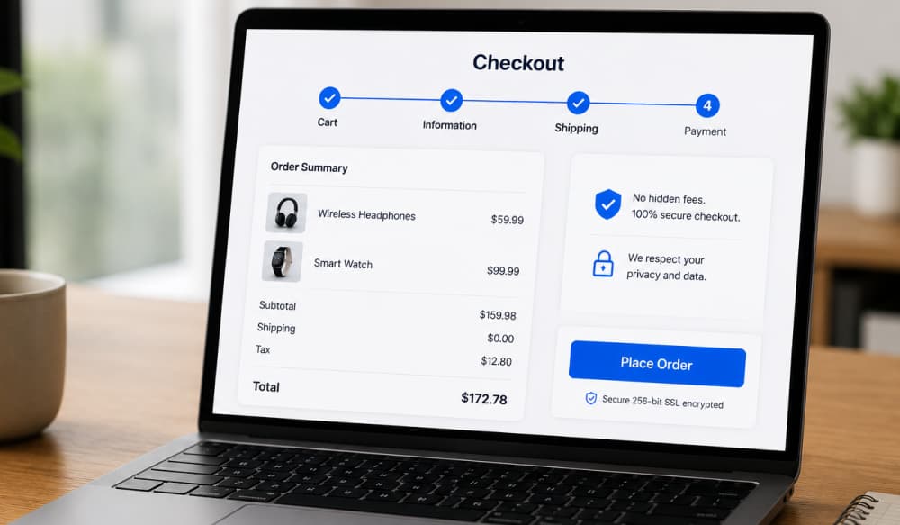
It’s this quiet honesty that turns a simple checkout into a moment of calm — where every detail is clear, the total is visible, and the shopper’s confidence is reflected in their final click. The illustration below captures that sense of trust — a seamless, transparent checkout experience where clarity wins over persuasion.

Checkout Transparency

When your pricing feels honest, users stop looking for fine print and start feeling comfortable enough to buy. That comfort, not persuasion, is what drives loyalty. True eCommerce trust building happens when the experience feels human — when transparency replaces pressure and clarity replaces confusion.

Because in the end, transparency trust UX isn’t a design pattern; it’s a reflection of your brand’s integrity. If your price looks honest, your brand does too — and that’s the kind of respect that keeps carts full and customers coming back.

Conclusion

Trust isn’t a design element you can add; it’s the outcome of everything you do right. The moment your prices stay consistent, your words match your intent, and your checkout reflects clarity — you’ve already built what most brands spend fortunes chasing: credibility. UX transparency doesn’t just make your store look cleaner; it makes your business feel more human.

Every baby eCommerce brand trying to reduce cart abandonment faces the same challenge — earning belief before earning a sale. The good news? Honesty does both. When shoppers see transparent pricing, they don’t just buy a product; they buy peace of mind.

At ZealousWeb, our UX team helps baby eCommerce brands achieve that kind of quiet credibility — where transparency turns into trust and trust turns into conversions. Because when honesty becomes part of your design, your store doesn’t just look good — it feels right. Ta

Turn Checkout Clarity Into Conversions — Connect With ZealousWeb’s UX Experts Today.

Connect With ZealousWeb’s UX Experts Today.
secure checkout

FAQs

Related Blog Posts

growth operating system

Why Agencies and SaaS Companies Need a Growth Operating System

March 23, 2026
Agency ScalingExecution SystemsGrowth Operating SystemSaaS Growth
impact of visual consistency on baby brand websites

The Emotional Impact of Visual Consistency on Parents

February 27, 2026
baby brand UXecommerce brandingemotional designvisual consistency
Baby store website UX audit analysis

What Makes Regular UX Audits Non-Negotiable for Baby Store Survival?

February 27, 2026
Baby eCommerce UXDigital MarketingUX AuditWebsite Optimization
ZealousWeb

Why Lifestyle Photos Drive Higher Conversions in Baby eCommerce

February 27, 2026
Baby eCommerce MarketingeCommerce ConversionsLifestyle PhotographyProduct Image Optimization
parent shopping behavior

3 Things That Change Every Year in Parent Shopping Behavior

February 27, 2026
ecommerce trends 2025omnichannel shoppingparent shoppingparent shopping behavior
Checkout redesign conversion

Before vs After — The Checkout Redesign That Reduces Cart Abandonment

February 27, 2026
Cart AbandonmentCheckout RedesignEcommerce OptimizationUX/UI Strategy
Baby Store Design Mistakes

3 Design Mistakes That Make Baby Stores Look Untrustworthy

February 26, 2026
baby eCommerce storesbaby store designeCommerce StrategyeCommerce UX
Typography for baby store UX showing trust

Fonts That Parents Trust: Why Typography Matters in UX

February 26, 2026
baby store website designecommerce conversion designtypography in ecommerceUX for baby brands
Bounce rate in baby eCommerce

Bounce Rate Red Flags — What They Mean for Baby E-commerce

February 26, 2026
baby eCommerceBounce RateConversion OptimizationeCommerce UX
baby store conversions

Optimizing Product Pages for Better Engagement & Conversions

February 24, 2026
baby eCommercebaby product pagesbaby store conversionsproduct page optimization