
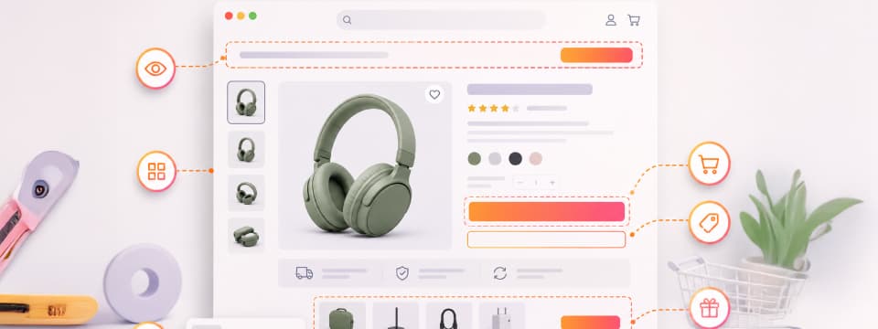
A Call to Action (CTA) is simply the prompt that pushes shoppers to take action—think “Buy Now” or “Add to Cart.” On baby product pages, these buttons are helpful as well as essential. Parents want decisions to be simple, so a clear CTA removes confusion and guides them right to checkout.
Product pages are where most parents spend time comparing and exploring before they commit. If your CTA isn’t visible or easy to find, even the best baby product may get overlooked. Placing that CTA strategically directly impacts sales. In fact, when a CTA button is placed at the end of the product page, conversions can jump by up to 70%.
That one detail, “where you put your CTA,” can mean the difference between window shopping and an actual purchase. In this guide, you’ll discover exactly how CTA placement boosts sales and makes baby product pages work for busy parents.
Optimal CTA Placement Maximizes Baby Product Sales
Turning visitors into buyers is every baby store’s biggest goal, and it starts with where you place your CTA buttons. For real results, it’s not just about adding a “Buy Now,” but placing it where it works best. Here are the key things to keep in mind when you’re writing your CTA text and choosing exactly where to put it.
The Critical Role of First Impressions for Parents
First impressions matter, especially for parents shopping online. That’s why baby product pages feature high-quality images, videos, and honest reviews. But these are not enough if parents don’t immediately see a clear way to take action. CTAs placed above the fold perform 304% better than those below it. Top-of-page CTAs catch attention right away, guiding parents toward buying or exploring further.
A CTA hidden in boring text or blended into the page won’t get noticed. Complementary visuals, like bright buttons, arrows, or images, help draw eyes directly to the CTA. Together, these elements create instant engagement, making it easy for parents to respond without second-guessing.
Keep Parents Focused with Repeated CTAs
Multiple CTAs on the same product page can significantly boost action. When parents see more than one clear prompt, it keeps the option fresh, increasing the chances they’ll click when ready. But balance is key. Too many CTAs, or too many competing messages, can overwhelm and distract. The goal is to support the flow of the page smoothly, not to bombard or confuse shoppers.
Avoid clutter by placing CTAs strategically where they make the most sense, such as after product descriptions, reviews, or shipping info. This keeps parents focused, reduces friction, and guides them steadily toward purchase without feeling pressured.
Leverage Sticky CTAs for Mobile Conversion Growth
Most shopping today happens on phones, and this trend is only growing. In India alone, mobile commerce is expected to make up 75% of all e-commerce sales by 2025. This means your baby store’s CTAs need to work beautifully on small screens.
Persistent, or sticky, CTAs that stay visible as parents scroll can significantly boost conversions. These buttons keep the action within easy reach, encouraging quick decisions without needing to hunt around. Designing for mobile means keeping thumbs in mind. People usually shop with one hand, so buttons must be the right size and placed where thumbs naturally rest. This makes it easy and comfortable for parents to complete purchases.
Reassure Parents and Build Trust Through Microcopy
Words that ease doubts and build trust can make all the difference in baby product sales. That’s where content marketing helps parents feel confident, safe, and informed before they buy.
Here are some best-performing reassurance phrases that work wonders:
- “Free returns within 30 days”
- “100% secure payment”
- “Fast delivery in 2-4 days”
- “Trusted by thousands of parents”
- “Expert recommended”
Where you place this microcopy matters as much as the words themselves. It works best near CTAs, on checkout pages, or around product guarantees, right where parents pause and might feel unsure. Strategically placed microcopy removes hesitation and gently nudges parents closer to completing their purchase.
Design CTAs That Demand Attention
Colors, size, and contrast play a huge role in how parents respond to CTAs. Psychology shows that certain colors like red or green can drive action—they capture the eye and spark feelings like urgency or trust. That’s why expert web designers carefully choose CTA colors that stand out against the page, making buttons impossible to miss.
Apart from design, coding also matters. Skilled designers ensure a parent-friendly visual hierarchy means arranging page elements so the most important things, including CTAs, grab attention first. Clear headings, good spacing, and bold buttons help parents scan and know where to click next.
Position CTAs Along the Customer Journey Naturally
Parents look for “Add to Cart” buttons near product details, price, or reviews—natural decision points. When CTAs are where shoppers anticipate, it reduces friction and speeds up buying.
Mapping CTAs to critical moments in the customer journey helps, too. For example, after highlighting product features, showing delivery info, or sharing testimonials, a timely CTA guides parents closer to purchase without confusion. Research shows that pages designed with a clear visual hierarchy increase conversions by up to 30%. White space draws eyes to the button, making it stand out clearly without overwhelming the parent.
Test and Optimize CTAs Using Data Insights
CTA placement alone won’t guarantee sales; it’s only part of the equation. The real impact comes from testing and optimizing based on data. Web analytics tools like Google Analytics or heatmaps help you understand how visitors interact with your CTAs.
A/B testing is a simple but powerful method to improve your CTAs. For example, you can test two versions of a button—different colors, text, or placement—and see which drives more purchases. This data-driven approach takes the guesswork out and lets parents’ behavior guide your choices.
To measure success, focus on these key metrics:
- Click-through rate (CTR) on CTAs
- Conversion rate from visitor to customer
- Bounce rate on product pages
- Time spent on key sections around CTAs
Regularly analyzing and refining CTAs using these insights ensures your baby store keeps converting more visitors into happy customers.
Transform Your Baby Store Sales With Expert CTA Strategies
Start Optimizing Today!
Conclusion
Every click counts when it comes to baby product sales. Strategic CTA placement and design are essential, but true success comes from constant testing and tweaking. ZealousWeb specializes in optimizing CTAs to fit your unique store, using data insights to drive more conversions and happier customers. Contact ZealousWeb today and let our experts help you turn more browsers into buyers.
FAQs
How can brands create personalized CTAs that resonate with new parents?
Personalized CTAs, such as those recommending products based on baby age or previous purchases, increase relevance and boost engagement by speaking directly to individual shopper needs.
What button shapes work best for CTAs on mobile baby product pages?
Research shows rounded buttons perform better on mobile, as they appear approachable and are easier for parents to tap comfortably with one hand.
How frequently should CTA texts and designs be updated to maintain effectiveness?
To keep CTAs fresh and aligned with evolving shopper preferences, it’s recommended to test and refresh them every two to three months.
Can exit-intent popups with CTAs reduce cart abandonment in baby eCommerce?
Yes, offering timely CTAs via exit-intent popups—like limited-time discounts—helps recapture abandoning shoppers and increases completed purchases.
What types of social proof near CTAs most effectively drive conversions?
Displaying customer reviews, trust badges, or “best-seller” labels near CTAs reassures parents, enhances credibility, and encourages confident clicking.


