
When parents reach the online checkout, they’ve already invested time comparing safety options for strollers or formula, thought about what’s truly right for their baby, and trust in your store to deliver reliably. The checkout process should feel like a quick, confident close. Instead, it often unravels everything.
Standard online checkout setups work for general e-commerce. They fail baby brands because parents shop anytime and from anywhere. Generic flows add steps like forced account sign-ups, page reloads, and unclear totals that hide until the end. No parent-first design means small buttons, confusing forms, and missing reassurance on delivery or security. This turns a moment of decision into doubt, pushing them to competitors.
That’s why this blog matters. It explains the checkout meaning in online shopping for parents, then shows you how to fix your checkout process with targeted checkout page optimization. Read on to cut drop-offs and build trust that keeps them coming back.
Why Do Baby Checkouts Fail During the Checkout Process?
When parents reach the online checkout, they’ve already spent time comparing safety features, checking reviews, and choosing what feels right for their baby. In that moment, the checkout process carries a lot of emotional weight. If the page is slow, confusing, or looks even slightly unsafe, it makes them second-guess their decision and your brand. They expect the online checkout to be quick, clear, and calm so they can move on with confidence.
Baby brands often lose parents here because standard flows are not built for this reality. Many stores still rely on generic templates with too many steps, forced account creation, unexpected fees at the last step, or forms that are hard to use on mobile. These are classic checkout page optimization gaps. There’s no clear progress, no gentle messaging that payments are secure, and no sense that the flow was designed for a busy parent on a small screen.
That’s when the checkout process fails, not because parents don’t want to buy, but because the experience doesn’t respect their time, stress, and trust.
Don't Let Checkout Friction Kill Baby Sales
Optimize with ZealousWeb
What Does Checkout Mean in Online Shopping for Parents?
For parents, a smooth online checkout is all about predictability; they want to know exactly what will happen next, how much they’ll pay, and when their baby’s order will arrive. If the flow keeps changing, totals jump at the last step, or the layout feels confusing, parents feel stressed instead of supported.
To make checkout truly easy for them, the whole flow has to follow a parent-first online checkout mindset. A parent-first online checkout mindset means designing the flow around real parent behavior and emotions, not just conversion graphs. It helps because it reduces decision fatigue, builds trust, and makes the checkout feel like a quick relief instead of another task. Parents are more likely to complete the checkout process and return to your baby store when it feels like the experience understands them.
This can be done in a few simple steps:
- Cut every extra field or step that isn’t essential to completing the order.
- Make key details obvious upfront: total cost, delivery timelines, and payment options.
- Add small reassurance cues, badges, and clear reassuring messages.
In e-commerce, the checkout process makes or breaks sales. If too long or complicated, parents bail. In fact, studies have shown 22% of customers abandon carts due to this exact issue.
2 Ways to Optimize the Checkout Page for Simplicity
For parents, the checkout process should feel almost effortless. It’s that final step where they just want to confirm, pay, and move on. If you want to make checkout truly simple for them, there are 2 core ways to optimize the checkout page for simplicity: how you structure the flow, and how you shape it for mobile use.
One-page Checkout
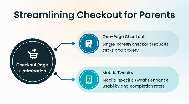
A one-page checkout means most key steps like address, shipping, and payment should be on a single, well-structured screen instead of multiple reloads. It means using clear sections, smart defaults, and auto-fill to reduce effort. Parents can see the entire checkout process at a glance, which reduces anxiety because nothing feels “hidden” or unexpected. They know what’s next, what’s required, and how close they are to being done.
This approach matters because every extra click or page switch is a chance for doubt, distraction, or drop-off. With auto-fill for saved addresses and card details, parents don’t have to type long forms. A subtle progress indicator (“Step 1 of 2”) keeps things predictable without forcing them through a long tunnel of screens. Together, this kind of checkout page optimization respects their time and mental load.
Mobile Optimization
Most parents complete their online checkout on a phone, and that’s why mobile-specific tweaks are much needed. Mobile-friendly checkout page optimization starts with large, thumb-friendly buttons, readable font sizes, and plenty of spacing between form fields. It also means placing key actions, like “Pay now” or “Continue,” where the thumb naturally rests, and keeping important information visible without endless scrolling.
This is important because a layout that looks fine on a desktop can feel cramped, confusing, or even risky on a small screen. If parents have to pinch, zoom, or hunt for the next step, they quickly lose patience. By optimizing for mobile, you make the checkout process feel calm and controlled. These small mobile tweaks directly impact completion rates as parents can stay focused and confident instead of battling the interface.
A smooth checkout process shapes how parents feel about your brand long after the payment goes through. When the flow is simple and stress-free, reviews improve—but the real question is: which online checkout options actually earn their trust?
Which Online Checkout Options Build Parent Trust?
The easier, safer, and more flexible the checkout process feels, the more likely they are to complete the order and remember your brand positively. Today, two options stand out as almost expected, not optional: digital wallets and Buy Now, Pay Later (BNPL). Both directly support checkout page optimization because they match how people actually like to pay online.
Flexible Payment Options
Parents are already using wallets inside their banking apps, UPI, or mobile wallets on their phones, so seeing those options on your checkout page instantly reduces friction. Instead of typing long card details, they confirm payment in a couple of taps.
This is important because wallets blend speed, security, and habit. They reassure parents that their payment data is protected, while also cutting the time spent on each step. For baby e-commerce, that means fewer abandoned carts and a smoother checkout process, especially on mobile. When combined with clear, upfront pricing and no surprise fees, wallets make the entire flow feel honest and efficient.
Buy Now Pay Later Payment Options
BNPL adds another layer of comfort by giving parents more control over how they manage bigger baby purchases, like strollers, cribs, or bulk essentials. Rather than paying everything at once, they can split payments into smaller, interest-free chunks. This lowers the psychological barrier at checkout.
Parents who might hesitate at a higher total are more likely to complete the online checkout when they see flexible BNPL options waiting for them. It often leads to higher-order values because they feel they can afford better or more complete bundles for their baby.
Pricing transparency ties these options together. Wallets and BNPL only build trust when parents see exactly what they will pay—today, later, and in total. Clear breakdowns of installments, fees (if any), and delivery costs are essential for true checkout page optimization.
How Can Web Apps Master Checkout Page Optimization?
Unlike rigid plugins, they handle complex logic behind the scenes, making the online checkout feel intuitive and alive. This matters because parents expect modern speed with zero lags, smart adjustments, and help right when needed, turning potential drop-offs into seamless completions.
- Adaptive Online Checkouts: These dynamically change based on user input, like showing local delivery options or hiding unavailable payments by location. It’s important because it cuts confusion, which means one less decision means faster trust and 20% fewer abandonments in the checkout process.
- Save-Resume: Automatically saves cart and form data if parents step away, letting them pick up exactly where they left off hours later. Critical for real life, as it respects interruptions and boosts completion by keeping momentum alive without retyping.
- Inline Support for Frictionless Checkout: Embeds quick-help like chat bubbles or tooltips directly on the page, answering “When will this arrive?” without leaving the flow. Essential since it resolves doubts instantly, preventing 15-25% of hesitations that kill conversions.
When you pull all of this together, you create a checkout process that quietly does the heavy lifting for parents. It respects their reality, keeps things moving, and turns your web app into a calm, predictable space where finishing a purchase feels simple, not tiring.
But there’s one more layer that matters as much as design and features: the copy.
Does Microcopy Boost Checkout Page Optimization?
Microcopy boosts checkout page optimization by turning cold, confusing moments into warm, guiding ones that keep parents moving forward. It’s the small bits of text sprinkled across your online checkout, like button labels, error messages, or tooltips that speak directly to their doubts.
For example,
- Instead of a blank “Error” pop-up, microcopy shows: “Address didn’t match, let’s fix it together.”
- Or under the total: “Taxes and shipping included. No surprises here.”
These human fixes for online checkout errors make parents feel supported, not scolded, cutting abandonment by making friction feel fixable.
Here are reassuring words in the checkout process that parents need most:
- Progress nudges: “Almost there—1 step left!” (shows control)
- Security whispers: “Your card is encrypted end-to-end.” (builds safety)
- Next-step clarity: “Enter ZIP to see exact delivery date.” (reduces guesswork)
- Error empathy: “Oops, that field glitched—no worries, try again.” (feels human)
- Confirmation calm: “Order saved! Finish anytime in 24 hours.” (eases pressure)
A good copywriter can spot where parents hesitate, through heatmaps or session replays, and craft these lines to match their emotional state. They test variations (A/B splits) to prove what lifts completions.
Hire ZealousWeb content marketers to craft powerful microcopy that boosts your website and app conversions.
Get Checkout Copy That Converts Now
Hire the Experts
What Pitfalls Ruin Baby Checkout Page Optimization?
Even after nailing simplicity, payments, web apps, and microcopy, certain pitfalls, like upsells and redirects in online checkout, push parents to abandon the cart.
Upsells and Redirects in Online Checkout hit hardest. For example, when parents add the needed items in the cart and then just before checkout, a pop-up blocks the way like “Complete your bundle! Add wipes for 10% off?” Or worse, after entering card details, she gets redirected to an external payment site with a clunky load screen. What happens? She panics: “Is my data safe? Where am I now?”
That split-second doubt makes her close the app and shop with your competitor instead. Upsells work better post-purchase via email; redirects erode trust by breaking the flow parents crave.
These pitfalls linger because they’re “standard” tactics from general e-commerce tools, not tuned for baby buyers who prioritize speed over extras. Spot them through analytics (spikes at upsell steps) and fix by keeping checkout laser-focused: no popups, stay on-site, save promotions for thank-you pages.
How Does Checkout Page Optimization Drive Loyalty?
A great checkout page optimization sparks repeat online checkout orders that build your baby store’s future. Parents who finish smoothly don’t forget; they return because the experience sticks as “reliable” in a sea of frustrating options.
Psychology behind the loyalty loop:
- Relief reinforces trust: Ending stress with a calm close triggers dopamine—parents associate your brand with ease, making next buys automatic.
- Memory over logic: They recall the “frictionless feel,” not product specs, driving 2-3x higher repeat rates per studies on emotional eCommerce.
- Word-of-mouth multiplier: Happy parents share “finally, a checkout that works” in mom groups, pulling in new traffic.
This matters because baby essentials mean ongoing needs. Nail the checkout process once, and loyalty brings back higher lifetime value, lower acquisition costs, and steady revenue.
Your Checkout Page Optimization Action Plan
You now have everything; it’s time for your action plan to refine the checkout process and track real wins in checkout page optimization.
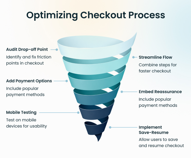
Conclusion
Your checkout process is the make-or-break moment for baby e-commerce, where 70% of carts vanish if online checkout feels clunky or untrustworthy. Parents seek checkout page optimization that delivers speed, security, and clarity, turning hesitation into high-value orders with flexible online checkout options they already love.
Checkout meaning in online shopping is a bond formed through frictionless flows that respect busy lives. Stores ignoring this lose repeat revenue; winners see loyalty surge as parents return for seamless experiences month after month.
ZealousWeb designs bulletproof e-commerce websites and web apps with checkout mastery—custom flows, parent-tested UX, and conversion-crushing strategies that scale your baby store. Schedule your 30-Min consultation call to mark out the strategy today.
FAQs
How to reduce cart abandonment in a baby e-commerce store?
You can fix cart abandonment by shortening forms to 5 fields max, adding trust badges early, and exit-intent popups with promotional discounts and offers. This combo cuts drop-offs by addressing fear of commitment and surprise costs right at checkout.
What is the ideal checkout page length?
Aim for one scrollable page under 800px height so parents can scan and complete in 10 seconds. Longer pages double abandonment because busy moms lose focus; test with heatmaps to ensure CTAs stay above the fold every time.
How much does checkout optimization cost?
DIY starts free with plugins like Shopify's free themes, up to $500 for tools like Hotjar. Agency builds custom flows for $5K-20K, but expects 25%+ ROI in 3 months from higher conversions on recurring baby buys like diapers. Contact us today for a personalised, detailed plan.
Is guest checkout better than account login?
Guest checkout wins big as it boosts completions 45% by skipping barriers for first-timers. Offer login optional post-purchase to capture emails; parents prioritize speed over profiles on impulse baby essential grabs.
How to A/B test checkout page changes?
Use Google Optimize or VWO: pick one variable like button color ("Buy Now" green vs. blue) or copy length, split 10% traffic, run 2 weeks for 95% confidence. Track add-to-cart to the purchase funnel for true wins.